Social media
Social media platforms, social networks, social media…
I remember when I first heard about Facebook. A friend was just back from an overseas exchange in Australia and she was telling a very wary Val – still hooked on MSN Messenger and just discovering the joys of an early, slow-functioning, buggy Skype – how everyone worth being called a cool kid had an account like that. I’ve always been a sucker for new stuff, I have to say… So I created a profile. At the time I was living in Italy and honestly,… it was already sensational if you *knew* anyone who *owned* an iPod back then, so the people I could really have and use Facebook with were mostly foreigners who had lived in the US or in an English-speaking country. I admit it did not seriously grow on me until later in time, roughly around 2008, when I moved to the UK to stay. Still the number of Italians using it was scarce, but I had got the hang of it by then and I actively used it to keep in touch with my friends around the world. After that, I think it all spiralled for me: I got Twitter first, then everything else was out there. Mainly out of curiosity and because of my designer boyfriend who helped me be in a tech “full immersion” condition at all times, in just about a year I was all in with social media.
As we speak, I am a proud owner of several social accounts:
to mention the main ones, along with pretty much anything that has to do with online connection, online exchange of files and boosting productivity as well as with my translation career (market place profiles, for instance). Not all of the above are FOR business; yet, if you really focus, you can find a reason for it and a good use that could bring time-related ROI and help with marketing yourself.

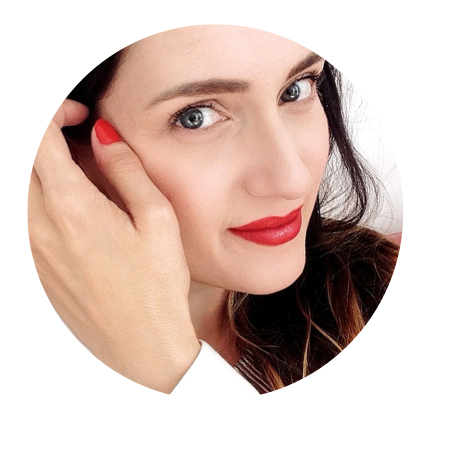
A good profile pic on social media is key
What are some of the advantages of getting on board with social media?
- SEO — Google will like you better;
- Lowering risk of people using your handles or name;
- A way to monitor yourself and your brand reputation online;
- Keeping in touch with clients — and a chance to keep up with their sites, feeds and events;
- Creating a link to someone otherwise inaccessible: interaction can really open doors. Engagement is key to bridging the gap and getting in touch with people you otherwise would not be able to reach;
- Sending & dealing with complaints — everyone knows that a complaint let loose into the online world of the Internet gets amplified 10,000 times than a regular complain or form you filled. Try it for yourself. It tells so much about reputation and the importance of having these tools as well;
- Keeping in touch with colleagues (aka: networking). Simples;
- Being at the ready when someone looks for your services;
- CPD opportunities — feeds can be daunting but if you have downtime you can read and learn of everything in beautifully crafted, at-hand snippets of information readily available on your devices. Great for those who travel!
OK, it’s coming: the CONS
- Addiction (!)
- A über visibility: good or bad. You make a mistake and as they say… it takes years to build a reputation and 5 minutes to destroy it.
- Exposure: risks of fraud or scam
- An over-connected life
- A reduced privacy (or at least the feeling it is so)
- FOMO and all the so-called modern “diseases” related to hyper connectivity and online stress (i.e.. always remember: not all that glitters is gold…)
Needless to say that these are things that can be avoided if you wish to and very easily. I’ve never experienced any of these issues – OK; maybe I’ve felt jealous flicking through the gorgeous pictures of the Caribbean getaway my friend had spent a week at but still) so I’m sure you can decide for yourself. I don’t see it as a matter of ‘all in or bust’; rather, I am sure you can in fact make use of social media in moderation, in the right measure for your and for the right purposes you aim to.
So, what platforms should freelancers have and why?
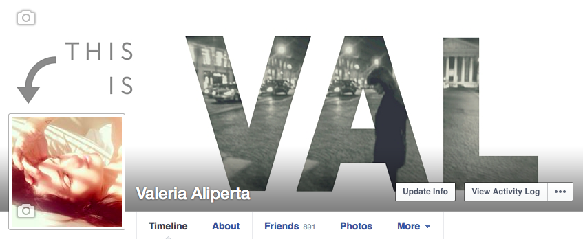
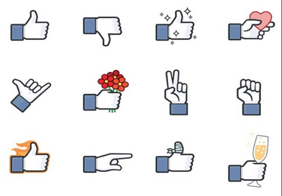
Facebook

Thumbs up. And more.
We mentioned LinkedIn last week (link) and briefly touched on Facebook. But Facebook is indeed growing as the main platform for businesses. As you may remember, I’ve got a personal and business page — and this format has proved viable for me so far. My personal profile has a “follow” feature, which allows those I‘m not friend with IRL or simply people who want to know more about me to follow my public activity. It’s ultimately the profile user who decides what to publish and to whom making it visible by whom so that it’s safe / appropriate. RL business page is reflecting the look and feel of the brand even though it uses a slightly fresher approach that is suitable to an online platform ie. banners, specific FB cover and so on. Customisation is king yet it still has to be in line with the original flavour of the brand. Apps and widgets can be added to the FB Page: Twitter feed, Polls, Photos, Notes, Pinterest feed just to mention a few. The new ‘Call-to-Action’ button is also very interesting: you can set it up to carry out several actions for you like Book, Buy, Sign up… Mine is currently on Buy because it directs visitors directly to my BigCartel shop where you can purchase my #rainycups and other merchandising. The best thing to do is try and keep the content you share interesting and varied. That’s why I tend to alternate frequency and nature of posts with a variety of photos, quotes, links, other people’s links/events, original content, information about the industry and similar work-related content and a bit of a personal touch (in the languages I speak/work with). It’s proven that a healthy mix of these components brings more engagement and keeps the audience on their toes. Remember: visuals are essential for even a great message to go down well.
Twitter

When “followers” took a whole new meaning
Twitter is a great source of on-point, concise information. I find this very useful especially when on the go because I can read short messages and be on top of news very quickly. Also, the bookmarking tools and the readers you can connect and link to Twitter are a godsend for this who plan their social media output on a weekly basis. Buffer, Feedly and Listly are just a few examples along with Hootsuite and Tweetdeck.
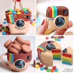
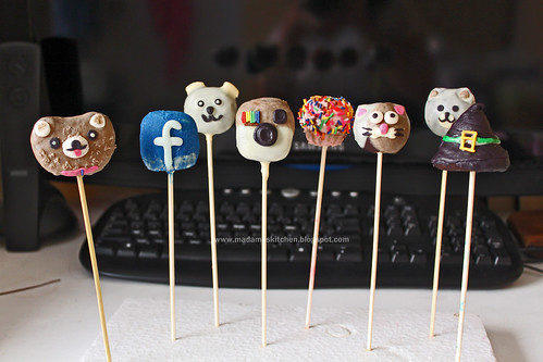
Instagram
 I’m a believer in great images and photography. My Instagram — partially personal despite being a public profile — mixes photos of what I do and what I like – I recently got a job via Instagram! One of my followers gave my name to someone who needed translation and that was it: a real job, that paid really well too. In short: for branding purposes, IG has become the fastest growing tool that big brands — and especially bloggers — are using to present themselves to the world and reinforce their identity. And with the upcoming carrousel function and paid ads, well… there’s going to be so much more to it for us in the near future.
FourSquare

The F word
FourSquare is based on geotagging and GPS position. It helped me find restaurants in Bratislava and find my way around the city; also, I remember that day it made me notice that a colleague was nearby, so we ended up having a cuppa together.
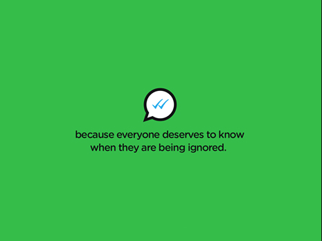
Skype, Telegram and Whatsapp

Ticking boxes
They may be “just” messaging tools but hey, we need to communicate, don’t we? I worked with a colleague on a project that had lots of back and forth comments to discuss. Doing it using voice messaging on WA was the way to go, making the flow quick and personal. And I’ve got a few clients who will contact me via the Skype chat to allocate jobs – I can accept them via my phone and it saves time and stress.
Periscope

Live broadcasting made easy
The newest and still controversial new live streaming service that I’m curious about. It’s like shooting a video on a webcam that goes live online and people connect to it to comment – in a chat mode, and it was used by Nicolas Sarkozy to run a press conference and show it to the world — or rather, those connected in live streaming to the app, which you log onto via Twitter. Of course you can think of privacy, relevance and then breach of security issues with this one but I see its endless potential for uses such as promotion of services, sneak peeks, launches of products and so on. Shame you cannot record the output of your live stream but that is what makes it all the more exciting. At the same time, I’d like to start using Snapchat – another notoriously ephemeral service – to target different audiences and see how it goes. Exciting!
SoundCloud
It may be all about music, but the fact that it allows for the upload of your own files makes it very useful for anyone who produces content. It can be used for short podcasts or audio files, or like I do, for voiceover sample demos. And it can be embedded into AboutMe for instance or used as a normal link anywhere you want.
Blogging
We all know that those who work with words should be first and foremost lovers of the written word, maybe avid readers and preferably great writers. Having a blog is not for anyone, as it means dedication, self- discipline and ultimately having something to say. Yet, it’s a good way – if not one of the most direct – to get the message out to existing clients and prospects alike. I’m restructuring the existing set of online writing tools I have (news coming up soon in the coming months) but at the time of posting this, I’ve got a branding blog and a translation blog. My idea is to be writing more and more for clients — possibly via newsletters tools like Mailchimp — so that I can give added value to them and build their trust in me as a good communicator too. One writing tool I like to mention and relates to this is Notegraphy, an app that helps you create personalised notes to share and use as posters. Great for quotes.

Spoilt for choice. Yet, think before you act.
Of course, this is merely an overview of why social media are crucial for me, why they make my life easier and help me with marketing; why you should consider them; and how the main ones work.
Are you using them?
Which ones are the most relevant for you?
Would you want to know more any of the ones I mentioned above?