
Today’s appointment with #RainyBrandingTuesday is about the importance of colours.
If you take a moment to think about it, colours play a very crucial role in life – imagine your life as a colour-blind person or a world as an old TV, in black/white. Your universe would look different, as would the mental associations you automatically do in your day-today life, starting from a simple traffic light i.e. red = stop, green = go. All would be altered.
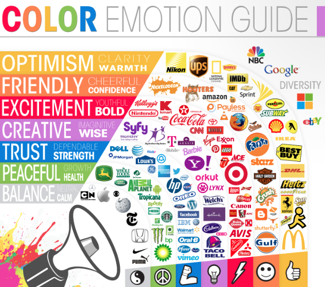
The same is true in all things branding: just think about Coca-Cola, or Microsoft, or Virgin and again, what about NHS or Bupa? Can you see a common thread?
Hint: Nothing is accidental. And it all depends on the type of business and the core strategy/goal of the company behind it.
It looks like it’s accidental…
The power of colour dictates the choices of a tone and the message the icon or the logo is set to achieve. As I often say in my workshops on branding, colours influence the viewer and they can be even more powerful – along with the right set of icons – than words (still, don’t worry, translators!)
As in fashion – and if you are an addict like me, you sure know the main Fashion Weeks in the world have now kicked off, with London just closing its door as we speak to leave room for Paris – colours are carefully chosen every season. And in design, a specific coding is used to define them and make sure they look the same and are easily referred to in a rather standardized way.
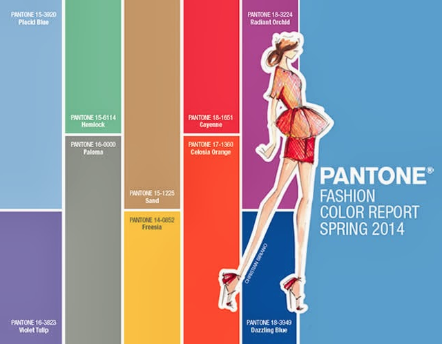
Spring 2014 has only one shade of Grey

A very Royal attire
Pantone is a system that encodes the chromatic palette and has in recent times become so iconic (and a bit mainstream) – look at these cute cups! – that now even fashion house refers to Pantone’s colour of the year.
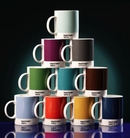
Definitely my kinda cuppa
So the idea here is to think about colours very thoroughly before using them on brochures, websites and logos.
My takeaway notes:
~ choose wisely and make sure the shades are harmonious together;
~ too many colors will be distracting and make your layout look unprofessional and ‘cheap’;
~ make them legible, think about their use on a screen AND in print (monitors alter the shade and the result can be brighter or more muted, esp. in the case of very light, pastel colours;
~ think about the business: red is usually very energetic or even aggressive but it-s easily remembered and stimulating; pink can be associated to a more girlish touch while green is naturally bringing up an environmental reference;
~ sometimes your logo will be printed in black. Does it work too?
A savvy use of the right colour palette:
- will make you remembered
- will make you be different
- will evoke the right feelings and sentiments
- will attract more of the clients you aim to captivate

I’m black. I’m white. Or both.
Want to read more? Deep dive here and here
Join the discussion:
- Why have you chosen the colour you have for your current business?
- Was it easy?
- Was there a rationale behind it? If so, what was it?

Pingback: COLOUR – chromatic history, perception & emotional baggage | Rainy London Branding