This month we show our true colours!

Chromatic history and perception
Just joking: it was just a mere few months ago when the Internet was broken about this dress and it was all about colour, one of my favourite branding-related topics. As BBC says,
you can measure it, hold it and count it. […] But colour is not light. Colour is wholly manufactured by your brain. How do we know this? Because one light can take on any colour… in our mind. And optical illusions are just that. In the same way, in terms of
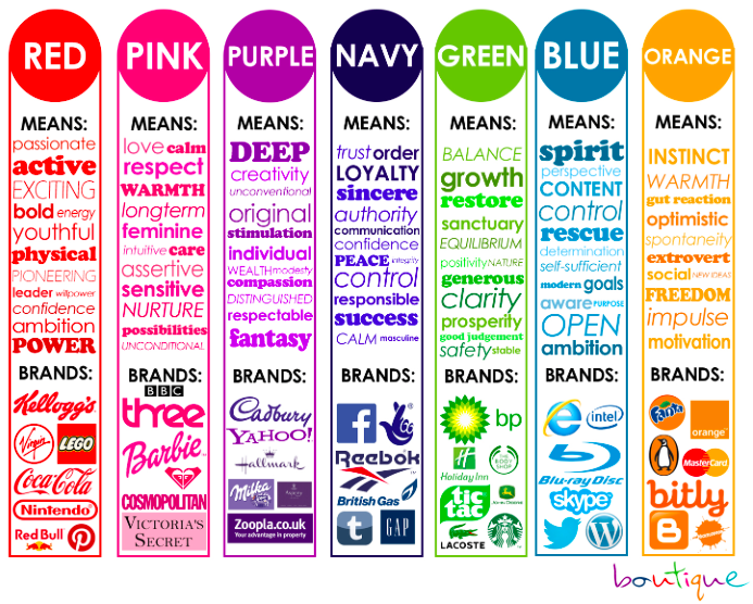
the relationship between emotions and colour, nearly every adult assigned yellow to happiness, blue to sadness and red to anger (surprise and fear, which are the other two universal emotions, had no obvious colour).In the same way, I cannot stop looking at this chart with all the shades in English:
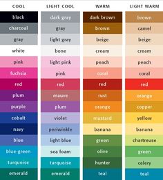
Ah, that’s handy
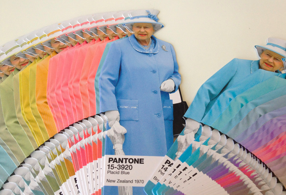
or at this very Royal Pantone set:

Shades of Elizabeth
so I’ve decided to share some interesting notes on colour. How did the ancient cultures use colours? Were they available? And how did they stumble upon them? Especially for the artists of earlier times, the palette was extensively limited, and some of their colours were immensely expensive, while some were unstable and tended to fade or darken. In order to make their materials and put them to the best use, painters once had to be chemically literate. Blue and turquoise came from lapis lazuli and were seriously precious and hard to find, that’s why the Virgin Mary in Renaissance paintings was most of the time wearing a bright blue veil, a precious token to pay tribute to the uniqueness and the importance of her role.

Back to our times… think about how
TV was in black and white just a while back. On the 20th April 1967 David Attenborough appeared on a news bulletin and explained that a
gradual introduction of colour film was necessary so that engineers and production staff had time to familiarize themselves with the new service.

David means home even to me.
Colour does shape our lives as much as branding and shapes do.
I am a black kinda girl — even though in recent years I’ve developed a passion for red, mostly in its pillar-box hue.

A red lip is always right.
Energy, passion and character: this is the message oozing from anything that I see or get in this shade. That’s why I’ve decided to adopt it every day a bit more in my daily life and in my brand. Choosing a colour is as personal as it gets — yet, it’s crucial to identify the emotions that are connected to it to make sure your audience perceive the same message and the same vibe as you, in the way you wish to convey it. In the same way, we perceive some colours based on the meaning society attached to them — just yesterday I asked myself: what if I had a boy and wanted him to wear pink? Would it still cause a debate?
My takeaways:
— colour is very important and remember, we do NOT perceive it all in the same way. If in doubt, run a survey and check if your readers / clients / friends see it like you do.
— colour can define a mission, a message, in short it’s a vehicle of meaning.
— it’s very culture-bound: white reminds of pureness, violet makes me think of lent, as a Catholic — yet, bright colours are conceived and used differently in India than in Norway, just to mention two examples.
— chromatic choices are important for user-friendly purposes ie. reading better on screen, clarity on paper, harmony in design and so on.
— we are emotionally involved with colours and we probably do not even know it: our behaviours as consumers are driven by that — just look at your house or your clothes to realise that we operate serial choices based on chromatic combinations.
Reference