Colour wheel and chromatic combos
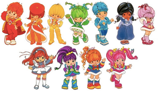
I remember being a little girl – circa 1984 – and being in love with this cartoon called Rainbow Brite (Iridella in Italian).

Stars and colours

There is always a faithful horse in these situations

Men are always the weak sex.
I’m sure this is the first memory of me and colours: each character was the walking symbol of a shade, and after 31 years, I see their figures and it’s vivid just as it was back then. Iridella was mesmerizing: she had the most beautiful costume and a corset the colours of the rainbow. Just like smells and perfumes, from a very young age, colour has a huge impact on our life. Imagine being colour blind: how would the world look like to you? (This is how).

Clowns are scary in all shades.
In the same way, every time we think of sadness and evil, we evoke an image of darkness, lack of light and colour. The same is true in marketing and consumer products. And to achieve the perfect combination, designers work towards mastering the Wheel of colour. But before that,
…what are the basics of colours?
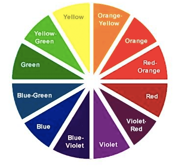
Primary colours: those colours that cannot be created through the mixing of other colours. They are colours in their own right: RED, YELLOW and BLUE. Primary colours can be mixed together to produce
secondary colours: blue +red = purple; yellow + blue = green; red + yellow = orange. An important rule of the colour wheel is that opposite colours on the colour wheel usually work well together as a colour scheme – these are referred to as
complementary colours.

Cool and warm.
(from Canva)
In theory, complementary colours, when mixed, will complete the visible spectrum: thus, two light rays of complementary colour will produce white, and two paints or inks of complementary colour will produce black or grey – says
the National Gallery glossary on painting. In practice, complementary colours are defined as colours that have maximum contrast for each other. The fundamental complementary pairs for painters are red/green, yellow/violet, and blue/orange, but each intermediate colour also has its unique complementary. The colour wheel arranges all the colours of the visible spectrum so that
complementary pairs are opposite each other.


Traditional wheel
As we read in Canva’s blog: understanding color relationships is fundamental to great design. Knowing how to navigate the color wheel can help you understand why certain colors look good together but others don’t. Visual marketing is a fantastic example of this. Did you know that in the first 90 seconds someone forms an impression, up to 90% of the outcome is based on color alone?

Brands and colours go hand in hand
Colours are always the same but as we all know… some are especially en vogue in specific times and eras and just go out of fashion in others.
What’s the trend at the moment? Fashion is a good example: after two years’ worth of choosing bright jewel colors,
The Pantone Institute of Color has surprised the fashion world with its
2015 color of the year. The winner is a dark, rusty brown identified as
“Marsala” 18-1438 TCX. Although the name connotes the color of the rich, earthy wine from western Sicily, less complimentary adjectives link Marsala to rusty warships, deteriorating ruins, liver, dried blood, mystery meat (as we read on
Color Combos).

Marsala and all its emotions. Can’t you smell it, almost?
MONOCHROMATIC
Monochromatic color schemes are made up of different tones, shades and tints within a specific hue. These are the simplest color schemes to create, as they’re all taken from the same hue, making it harder to create a jarring or ugly scheme (though both are still possible).
ANALOGOUS
Analogous color schemes are the next easiest to create. Analogous schemes are created by using three colors that are next to each other on the 12-spoke color wheel. Generally, analogous color schemes all have the same chroma level.

Rainy London Translations’ page uses shades of brick red and ochre.
COMPLEMENTARY
Complementary schemes are created by combining colors from opposite sides of the color wheel. In their most basic form, these schemes consist of only two colors, but can easily be expanded using tones, tints, and shades.
SPLIT COMPLEMENTARY
Split complementary schemes are almost as easy as the complementary scheme. In this scheme, instead of using colors that are opposites, you use colors on either side of the hue opposite your base hue.
TRIADIC
Triadic schemes are made up of hues equally spaced around the 12-spoke color wheel. This is one of the more diverse color schemes.
DOUBLE-COMPLEMENTARY (TETRADIC)
Tetradic color schemes are probably the most difficult schemes to pull off effectively.
How to go about it?

The power of the wheeeeeel
1. Colors directly next to each other (i.e. yellow and yellow-orange; yellow and yellow-green; violet and blue-violet, etc.)
2. Colors that form right (90 degree) angles with each other (i.e. yellow and red-orange; blue and violet-red; green and orange, etc.)
3. Colors directly across from each other (i.e. yellow and violet; blue and orange; red and green, etc.)
4. Colors that form a T (i.e. blue, orange, and violet-red; yellow, violet, and red-orange; yellow, blue-green, and red-orange, etc.)
5. Colors that form an X (i.e. blue, orange, violet-red, and yellow, violet, blue-green, and red-orange, etc.)
And remember, colour does matter. Choose well.

Subconscious. It’s all hidden down there.
Read more:
Colour scheme tools:

