Colour wheel and chromatic combos
I remember being a little girl – circa 1984 – and being in love with this cartoon called Rainbow Brite (Iridella in Italian).

Stars and colours

There is always a faithful horse in these situations

Men are always the weak sex.
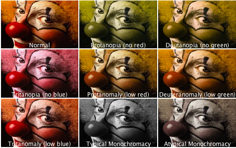
Clowns are scary in all shades.
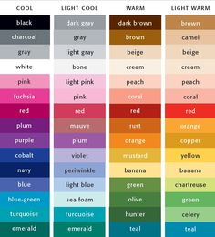
…what are the basics of colours?
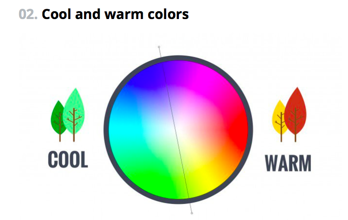
Cool and warm.
(from Canva)
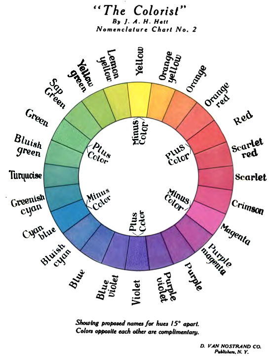
Traditional wheel
As we read in Canva’s blog: understanding color relationships is fundamental to great design. Knowing how to navigate the color wheel can help you understand why certain colors look good together but others don’t. Visual marketing is a fantastic example of this. Did you know that in the first 90 seconds someone forms an impression, up to 90% of the outcome is based on color alone?

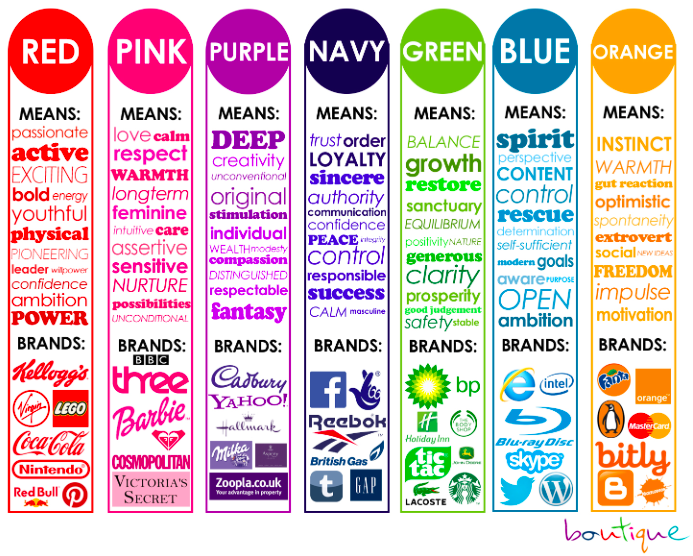
Brands and colours go hand in hand

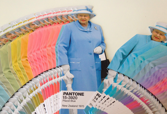
Marsala and all its emotions. Can’t you smell it, almost?
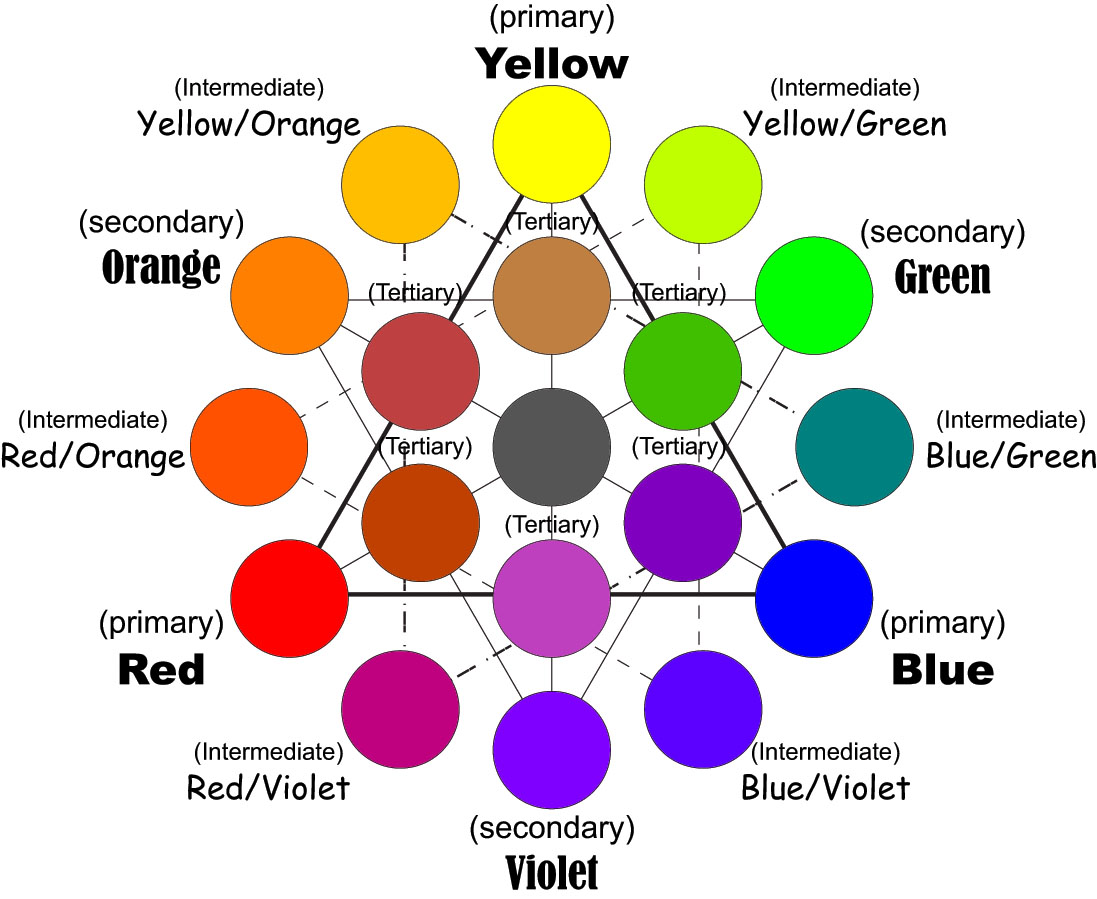
MONOCHROMATIC
Monochromatic color schemes are made up of different tones, shades and tints within a specific hue. These are the simplest color schemes to create, as they’re all taken from the same hue, making it harder to create a jarring or ugly scheme (though both are still possible).
ANALOGOUS
Analogous color schemes are the next easiest to create. Analogous schemes are created by using three colors that are next to each other on the 12-spoke color wheel. Generally, analogous color schemes all have the same chroma level.

Rainy London Translations’ page uses shades of brick red and ochre.
COMPLEMENTARY
Complementary schemes are created by combining colors from opposite sides of the color wheel. In their most basic form, these schemes consist of only two colors, but can easily be expanded using tones, tints, and shades.
SPLIT COMPLEMENTARY
Split complementary schemes are almost as easy as the complementary scheme. In this scheme, instead of using colors that are opposites, you use colors on either side of the hue opposite your base hue.
TRIADIC
Triadic schemes are made up of hues equally spaced around the 12-spoke color wheel. This is one of the more diverse color schemes.
DOUBLE-COMPLEMENTARY (TETRADIC)
Tetradic color schemes are probably the most difficult schemes to pull off effectively.
How to go about it?

The power of the wheeeeeel
1. Colors directly next to each other (i.e. yellow and yellow-orange; yellow and yellow-green; violet and blue-violet, etc.)
2. Colors that form right (90 degree) angles with each other (i.e. yellow and red-orange; blue and violet-red; green and orange, etc.)
3. Colors directly across from each other (i.e. yellow and violet; blue and orange; red and green, etc.)
4. Colors that form a T (i.e. blue, orange, and violet-red; yellow, violet, and red-orange; yellow, blue-green, and red-orange, etc.)
5. Colors that form an X (i.e. blue, orange, violet-red, and yellow, violet, blue-green, and red-orange, etc.)
And remember, colour does matter. Choose well.

Subconscious. It’s all hidden down there.