

I love beautiful things, and images. A passion that links back very strongly to design and elegant shapes. Those who follow me on social media by now will be aware of my passion for iconic graphics, neat pictures and illustration along with clean lines and strong looks — especially true for colours and for clothes. I enjoy looking at perfectly constructed compositions and even if I’m a spontaneous, imperfect person, I like to think of myself as someone with taste and balance. Graphics are — just like video, that we talked about just last week — part of our day-to-day life, and without noticing every day a little more. Design surrounds us — and it pretty much makes things what they are.
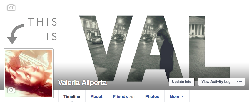
Val’s Facebook Cover
But what is in there for us as freelancers? What are the advantages of creating / using beautiful images?
- Clearer message — it’s great to share links and text (ultimately we need texts and explanatory paragraphs to understand in depth but what we want at first is a clear message. Short, to-the-point infographics are really popular and help save reading time.
- Reliability — your brand should be showing off who you are and also why prospects need to choose you and not other freelancers. If you go for cheap, stock images or graphics that are either dated or unclear, it’ll show.
- Professional images — be it your own headshot or a banner for your website, quality images create trust. Fact.
- Quality-infused, professional impression — you cannot give a good second, first impression!
- Higher shareable factor / more clicks — it’s proven. As I said last week about videos, the chances of clicking on a post featuring an image are higher than for posts with no graphics or with a longer text. As attention span gets shorter, we need to capitalise on what appeals to the eye and gets shared more.
- Better visualization, esp. on mobile — Sharp, hi-res images with eye-catching, bigger fonts are better viewed on smaller devices — and with the advent of mobile offices, well, you don’t want your reader to be disappointed when what they click on does not read clear.
- Consistency to complement the brand identity — if the style is in line with the brand, it’ll create consistency and build trust.
- …FUN — at least for me 🙂
You may wonder what can we do as freelancers with all these imagery. Here some examples of output:
- Social media post
- Instagram / FB /Twitter ad format — make sure the format is right for these channels, which have very specific sizes.
- Banner
- Poster
- Ad
- Newsletter (think of Mail Chimp)
- Facebook / Twitter cover
- Magazine — Issuuu is one good example
- Brochure: see mine here
- Leaflet
- Flyer
- Catalogue
- Business cards: the better the resolution, the clearer the font, the stronger the message you send across.
- Postcards
- Presentations / PDFs

So, where to find images? Here some hints:
- iStock
- Shutterstock
- Getty Images
- Fotolia
- Flickr (Creative Commons licence)
- Unsplash
- …or simply contact the owner ans ask!
Find inspiration on design galleries too, some of my favourite are:
- Awwwards
- Logopond
- Best Web Gallery
- Site Inspire

A cuppa, in b/w and red (@rainylondon’s IG)
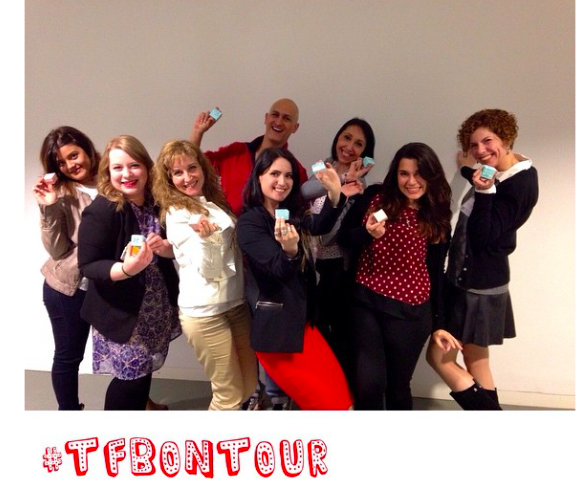
#TFBonTour and its boxers: an example of font use for a fun photo
Here’s my top apps to edit photos:
- Facetune — lots of filters and handy functions like the “smooth brush” are perfect to create softer tones and colours.
- Diptic / Layout — these apps help you create photo collages and they’re super easy to use.
- Phoster — create interesting poster-format images to share
- Over — to write beautiful fonts on your own images
- Canva — the most complete of all but only for desktop (and now iPad). You can create all the abovementioned type of outputs with this basic design-for-dummies website.
- Whitagram — to add a nice frame to your images, and while you’re at it, reduce their size to fit better on IG and other platforms.
- Instagrid Pro — you can create amazing-looking Instagram puzzle picture, using a minimum of 3 photos and showing them in a visually impacting effect on your IG feed.
- Squaready — make your photo square for IG and other platforms, very handy.
- Aviary — ideal for making colour pop e.g. a black and white image with just a splash of colour is possible by selecting intelligent colour to bring out from the photo.
- Camera+ — the main feature for me is the chance to take auto-shots, but hey, now on iPhone you can with the native app for the camera 🙂
- Enlight
- VSCO Cam
- Union/Matter/LoryStripes/Tangent/Fragment — they come as a package with a wide range of very specific features.

Diptic is so handy (amazing friends not included)
Unsure of how to combine fonts? Or which one to use?
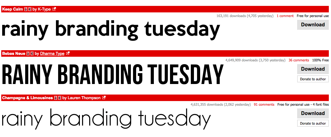
Samples in Dafont
To check of find inspiration for fonts, read this very handy guide from Canva and I also recommend Dafont or MyFont, websites featuring list of fonts you can try with an instant preview and buy for commercial use.
Well… What are you creating next?
(p.s.: most of these apps are for iOS)
