Emotional, branded worlds: copywriting aimed to touch your soul

Welcome back, it’s #rainybrandingtuesday and it’s the first appointment of the year. Yay!
Life is sweet

Emotions are the spice of life.

I know we already touched on this before (here and here) but copywriting is such a crucial skills for translators (and it does have a lot in common with sales and branding, for a change).
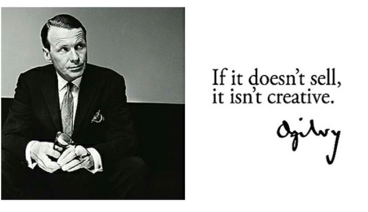
Advertising has changed so much over the years and customers are getting more and more demanding. Yet, the simple mantra still stands: people hate being sold to. That’s where good copywriting skills come into play. I recently took a course on copywriting at the Guardian that really confirmed my existing knowledge and encouraged me to follow in this direction. Writing well can help you sell more.
Masterclass at The Guardian

Masterclass at The Guardian

Some of the points I’d love to share are the following:
  • it’s all based on emotions: create the illusion of intimacy, even if it’s a techie subject. Give people value, a story that convinces them, based on their needs and wants. It’s the so called “emotional manipulation” – not a nice concept maybe, but if we want to funnel people to act (buy) that is what we’re doing.
  • Know your audience: read what they read, find their voice, find what they like and where they go. In other words: find a common denominator and talk to many as if one.
  • be memorable: use concepts and words that have a long tail and can percolate through the mind and the emotional grid of your readers. Like Xmas
  • prove you’re the authority without being patronising but instead showing you’re one of them. Leave jargon aside and be an expert in simple English. It shows you don’t need to impress because hey, you’re at the top of your game.
  • don’t try too hard – it shows lack of confidence. when people realise that, it’s a deal breaker, the sale is off. And also never be boring or overfamiliar, because it can be off-putting.
  • storytelling is key: try to not write about a product or service, sell a result instead. Something that is emotionally resonant (seen the ad from Thompson? Teddy bear) because you’re trying to persuade, to hijack your audience’s emotions to what you wish them to do.
  • list the benefits: but make sure you list them as they solve a problem. Focus on the most appealing result and work your primary sell, then try and sell a second point. People are smart, give them a flaw and deny it to them, solve the problem. In translation this can be price or delivery timing, for instance. The go back to the primary selling point and make it stick in the memory.
  • use power words: Free, Limited, YOU are some of the most amazing out there. Aren’t they? These trigger intimacy and safety and also a bargain opportunity. Why say no?
  • We all have some inner driving forces that push us to take action and in general… live our lives as we do. You may leverage on:
Fear | Love | Vanity | Greed | Guilt | Nostalgia | Pride
Life is sweet

Life is sweet

So just offer people something that either amplifies or reduces these forces. And don’t forget: offer people something that can save them

  1. time
  2. stress
  3. money

How to apply this to our freelance translation business?

  1. Market research. Study your prospect audience using the W-questions: why? who? what? when? and identify your viable target.
  2. Find out what you want to sell and choose a channel. Translation? Interpreting? Whatever-you-can-think-of-for-a-fee? Find WHY your audience may need these products and HOW you’re going to improve their lives through them. Give them an example of your work, make the audience feel involved and part of it; tell them a story on how you helped interpreting for a very emotional situation and you saved the day. It could be the same for them and their business.
  3. Don’t brag. IMHO, there’s no real need to be showing off your degrees and qualifications too much on your website – unless they are relevant for your audience. I’d rather you explained why your qualifications make you the best (then if asked, you can provide more details on grades, certificates, CVs, etc). You’re the expert they chose, just prove it.
  4. Always list the benefits. And the problem you are solving for them (and sometimes help when they didn’t ask for it)
  5. In your copy, it’s WE you need to use. Refrain from overusing the pronoun “I” because it tends to create some degree of discomfort in the reader – they know it’s you they’re hiring but a more collective, reassuring we makes you look all the more reliable and close. Psychology, again.
  6. Write impeccably. And if you’re not cut for creative, compelling copy, it’s fine. Just hire the right person. It’s incredible how a change in a word or phrase can dramatically change the effectiveness of an ad.
Hire a pro

Hire a pro

If you want to expand on this:

TAKEAWAY

People buy with emotions first and then justify with logic afterwards.

Telling a story, always

Telling a story, always

Advertisement

Distribution strategy: the key to your social media “share” (yes, pun intended)

The currency of social media is the share. – Courtney Seiter

Share! Life! Buzz!

Another #rainybrandingtuesday! I had the pleasure to address a group of translation students in Castellón last Fridayto talk branding and other things I love.

Rainy London en la UJI

Rainy London en la UJI

One of the many topics was why market your services to be visible is so important and that linked back to the relevance of social media – and their feature of “free”. As I repeat all the time, you do have to invest time on your social media but if you plan savvily, it’s not that taxing after all. The question one student asked me was indeed “How much time should I spend on social media for marketing purposes?” and then he fired back straight after, asking “How much time do YOU spend using them”? I laughed as my free time is spent equally living and then, well, checking my social media so I can’t say I’m the best example of how many hours you should or should not spend 🙂 But then I explained how you can plan it all. Great content is king – and we have discussed about it in the past – but it has to be shared with the right audience in the right moment or it runs the risk of going unnoticed. How?

You have to create a distribution strategy.

As read on Buffer’s blog, these are some of the ways you can share content.

The channels are endless

The channels are endless

You just need to find out when. This article summarises perfectly the right times to share content.  You can use Buffer, my favourite.

How Buffer works

How Buffer works

And SocialBro helps you find out when to share. This list of tips is great and the one I like the most and find most useful is number 5:

Tip 5: Post with your audience in mind.

Who are they? If you’re marketing to young adults, they use Twitter in a very different way to a slightly older audience. For example, they’ll be more likely to Tweet at 2am than someone who needs to be up for work at 6am.
Where are they located? Pay attention to your market. If you’re UK-based and trying to attract a wider US audience, post at optimum times in the US to make sure they’re always seeing your Tweets, otherwise you mind find all your Tweets are lost in translation.
Think mobile. Twitter revealed 60% of their user base logged in via mobile devices at least once a month. Increasingly, users are using their phones to use Twitter rather than their desktop computers, so make sure your posts are optimized for mobile. Especially as 79% of mobile users are likely to browse Twitter several times a day… more chances for them to see your posts!

PLUS: check out his interesting infographics too to see at a glance the science of timing in action.

Attribution is key

Attribution is key

So, to recap:

  • plan ahead (how many posts or tweets etc a week)
  • scout for content (you can produce your own or use Feedly to share interesting things)
  • is it helpful?
  • would people thank you for that?
  • would you click on it yourself? – or: does it make you feel cool?
  • would you email it to a friend?
  • analyse your audience: if you work in communication, it’s likely that all events are by night or weekend, translators usually are working in an office time frame (even though it’s common to work during w-ends!)
  • always make sure your attribution is there (you can use this WhoTweetedItFirst
  • check your statistics: you can see how many clicks and why (ps.: links and photos are great hooks)

Some food for thought:Share! Life! Buzz!

  1. http://www.socialbro.com/blog/best-time-post-twitter
  2. https://blog.kissmetrics.com/science-of-social-timing-1/
  3. https://blog.bufferapp.com/a-guide-to-social-media-sharing-what-when-and-how
  4. http://www.fastcompany.com/3026897/work-smart/what-when-and-how-to-share-on-social-media
  5. http://socialtimes.com/attribution-still-important-even-social-media_b141427


I shot the Serif: right typeface, more power to your logo

Just the other day I listened to a webinar on communication and the designer who was giving it was mentioning the type of fonts.

Clever.

Clever.

As read in Wikipedia...in typography, a serif /ˈsɛrɪf/ is a small line attached to the end of a stroke in a letter or symbol,[1] such as when handwriting is separated into distinct units for a typewriter or typesetter. A typeface with serifs is called a serif typeface (or serifed typeface). A typeface without serifs is called sans serif or sans-serif, from the French sans, meaning “without”. Some typography sources refer to sans-serif typefaces as “Grotesque” (in German “grotesk”) or “Gothic”,[2] and serif typefaces as “Roman” (you know, my ancestors created along with the Greeks sooooo many things back then).

Grammar police...

Grammar police…

But why should we talk about fonts and design so closely?

Because the choice of the right font (which is the readable part of a logo) can really help convey the right message to your audience. As well as choosing the right audience, the right shape and the right font can help really hit it off. I second what Big Brand System says: “the right fonts give your words a “voice” and a personality. It’s a high-impact, low-cost way to make a big brand impression. But let’s be clearer and look at a graphic explanation of what type of fonts are out there. Quoting Dummies.comfonts fall into two basic categories:
  • Serif: Serif fonts have tops and tails at the ends of the letter strokes. These fonts are often used for print documents and are considered more classic style fonts. Most books are printed in a serif font because it lessens eye strain.

    Serif cheatsheet

    Serif cheatsheet

  • Sans serif: Sans serif fonts have a cleaner feel because they don’t feature any extra marks at the ends of the letters. These fonts tend to have a more casual feel, and they have become the standard for online copy because they’re easier to read on a screen.
Popular Sans Serif

Popular Sans Serif

So to recap: why choose one or the other?

Serif is normally seen as:
  • classic
  • more readable
  • stable and reliable
Sans Serif is normally seen as:
  • more modern
  • more casual and fresh
  • more “creative” and alternative
All in all, a good mix could be the solution. As read in my beloved Smashing Magazine, the key is combining a Sans Serif with a Serif. By far the most popular principle for creating typeface combinations is to pair a sans serif header typeface with a serif body typeface. This is a classic combination, and it’s almost impossible to get wrong.
Another good way to play with fonts is by contrast. You can use different font weights, so the reader can distinguish what you want them to focus on first and so on. Smashing Magazine suggests that in addition to variations in size, make sure you are creating clear differences in font weights to help guide the reader’s eye around your design.
If you want to expand, the best way to do it is by reading this more techie article on fonts.

But for now, I’ll give you MY summary of what my choice would be for an high-impact branding based on the use of fonts:

  • Look for visual compatibility but don’t underestimate the power of contrast
  • Use colours: they can help guide the reader
  • Don’t be afraid of innovation but make sure your product is suitable for the style
  • Typefaces have a personality so don’t misidentify the personality of a typeface for a particular purpose
  • Mix weights and types but always assign a clear role to them, esp. in blog writing
  • Get the help of a pro: they’ll know what to do!
Choosing the right font

Choosing the right font

Read more: 

IMG_4579.JPG

Of writing, persuasion and “text” appeal

Ninety percent of selling is conviction, and 10 per cent is persuasion.

-Shiv Khera

I noticed that these days, more and more, we are facing an overwhelmingly strong tendency to hit the “Submit” or “Enter” button very much too quickly – be it in accepting T&Cs, in posting Facebook statuses, in sending instant messages and SMS and also… in sending over quotes or emails. And for as much as I’m concerned about #grammarnazi issues here, I am talking about the content. Needless to say that you could be the most talented of translators or freelancer or designer or architect but when communication comes in, you need to produce compelling text that convey the message and get you where you want to be (in a nutshell, writing better content and use persuasion). And writing with “text appeal” (quoting my friend Jorge ), ladies and gents, is part of a smashing brand effort.

Once it's sent, that's when I best proofread.

Once it’s sent, that’s when I best proofread.

As I read on BBC, when writing you can:

  • write to argue
  • write to persuade
  • write to advise
Differences in approach...

Differences in approach…

In all of the above, you are offering ideas to other people. However, each style does this in different ways. If you argue, the writing tends to look at both sides and come to a conclusion. If you persuade, it tends to be one-sided, making your ideas the only sensible choice. If you advise, it tends to be softer, guiding someone towards your ideas.  And the one we want to focus on is persuasion. Get an idea of what it is using this wheel:

Persuasion can be learnt

Persuasion can be learnt

This very interesting article explains in 10 points what are the writing techniques we all should focus on:
  1. Repetition
  2. Reasons Why
  3. Consistency
  4. Social Proof
  5. Comparisons
  6. Agitate and Solve
  7. Prognosticate
  8. Go Tribal
  9. Address Objections
  10. Storytelling

Joanna Wiebe also gives us some interesting tips on how to write and convince people that what we are selling is the right choice for them:

Here are actions you can take right now – CHOOSE ONE:

1. Reorder your bullet lists to ensure the items in the middle are least important to prospects

2. Set up a headline test on any page – it doesn’t have to be on your home page – where you replace 1 of the words in your current headline with something “bizarre”

3. Adjust your most sent autoresponder to repeat your value proposition across each email in the series (e.g., in the email header)

4. Where you have a small line of text – like a subhead or an About Us line in your footer – tweak it to make it rhyme.

In one of my MBA for Translators, run with The Freelance Box (co-hosted by Marta) I illustrate the anatomy of a convincing email to approach a new client / prospect.

  • INTRO: introduce why you’re writing without starting with hard selling from line 1
  • FLATTERY: let the client know you read all about their business and how much you like it
  • THERE’S ALWAYS A BUT: find a reason why what they’re doing could be better (ie. thanks to YOU)
  • YOU COULD BE UP HERE: show why changing what they’re doing is beneficial for their business (eg. hiring translation services) and giving proof (statistics or links)
  • DANDY SOLUTION: present your business and introduce yourself (name, quick reference to experiences without listing too much)
  • CALL ME MAYBE: offer to check back on them in a while or to go and see them in their offices. Setting a deadline or offering a meetup show good faith and openness
  • AU REVOIR: just elegantly close and say goodbye, making sure you attach info or PDFs with your services or T&Cs.

SHAMELESS PLUG: Our next events are in Castellón, Spain and Derby, UK. Join us!

Finally, the best cheat sheet I’ve seen in a while and that you can totally use for shaping your better writing is offered by Vero:

20 tips - and they're all great

20 tips – and they’re all great

I love them all, but if I had to choose, I’d incorporate the following tips in my strategy:

  • 2, SHOW THAT YOU CARE – as people buy from people after all
  • 5, GET PERSONAL – they’d rather buy from a trusted person they can relate to
  • 13, OVERWHELM WITH VALUE – even if it’s your normal service, make it stand out as if it was only for that client
  • 16, MAKE PEOPLE HAPPY – we all like that. And be nice, that’s unexpected!

To expand on persuasion and effective writing:

  1. Copyhackers on writing psychology 
  2. 20 tips from Vero 
  3. Resources to write persuasively 
  4. Writing effective emails 

6 examples of marketing material that showcase your style

Today I will be running a webinar in Italian – normally, I present in English, and it’s always a great change to do it in my native language – and I will be talking about how important networking is. One of the sections of my presentation is dedicated to marketing materials, with great stress on business cards, fundamental tool for any in-person event we are considering to attend.

Print can be on anything

Print can be on anything

Yet, I thought it would be worth sharing a short list of example of marketing materials that can help you position yourself, advertise your services and establish your own style.

Yes, marketing materials are and should be heavily branded:

– your style
– your rules
– your colours
– your text
but also
they should be ideal for your audience and prospect clients.

Leaflets

A leaflet can be useful for various purposes, mainly targeting:
  • local community
  • trades shows
  • postal clients

but also:

  • to go with hard copy documents
  • to be used as a nice, print follow-up to clients

Anatomy of a leaflet?

While it can be classic or more edgy, it should have:
  • clear message
  • clear font
  • list of services
  • contacts!
  • call for action or stimulus
  • possibly bilingual?
  • not too big

Cards

Business cards are the must-have item for any freelancer. Essential for networking, they can be easily put into an envelope or used as a conversation starter. I suggest you get loads and do not underestimate that people like to get them and collect them. You could also have different types of cards for different purposes eg. a promo, a launch…
Cards can be concise yet fun

Cards can be concise yet fun

Anatomy of a card?

Mine has a certain thickness and can be written on. I’d include:
  • Contacts
  • Phone
  • Full name
  • Optional: location / address (I’d rather not say that unless it’s a public office)
  • Language combination
  • Photo / double-side: if you feel it works in your language / culture

Graphic CV

This is not necessarily printed, in fact there are solutions to have one online. I quite like the option offered by Slideshare (you need a profile) but you can get one done with the help of a designer or for the brave ones, try it out with Canva and similar DIY programs (InDesign, but it’s a bit more pro) and apps. You can use it for direct clients or agencies but I suggest to always make sure it is adapted to the audience e.g. a direct client does not (should not) want to know about how many million words you’ve translated as s/he has no idea so maybe remove that detail from the CV. An agency, instead, is interested in other info like your hardware or software so there you go, tweak the CV based on the recipient to make it impact more.

Anatomy of a CV?

  • clear language
  • clear font
  • show your contacts clearly
  • it’s a PDF and has a watermark
  • not longer than 2 pages

A6 Cards

A6 format cards – the classic postcard size also known as flyer – are a great alternative to leaflets as they are practical, smaller and cute, and can indeed be sent as postcards. Moo makes some that come with a back to write addresses. Also, they can be cheaper as it’s not a foldable item even though on the downside, the content must be shorter. I prepared this for an event.
Robots don't do translation

Robots don’t do translation. But if they do…

Anatomy of an A6 card?

  • normally features a graphic side
  • content should be to the point
  • never too crowded with text
  • back for address, if you want to post it
TIP: Customise them and put your logo on them – I got mine with Ripe Digital and I normally have my Xmas cards done here too.

Brochures

If you have in mind meetings with clients for larger projects or different services, you could think of brochures as a way to offer your prospects an overview of your work in a full-package style. You could also include sample translations in your pack, nicely organized in a custom folder with your logo and info.

Anatomy of a brochure?

It’s up to you, really. The basics are the same:
  • clear language
  • clear font
  • show your contacts clearly
TIP: Make sure the quality is good – a cheap printed folder will not give the impression you envisaged!

PDFs

It’s the solution I prefer. Recently I’ve been converting Powerpoints to PDFs too, as it’s an infallible format and it works across any platform w/o conflict. PDFs are great for all of the above and especially to attach onto e-mails:
  • T&Cs
  • Tariffs
  • Quotations
  • List of services
  • Special offers
  • CVs
  • Sample of work…
If you have some templates ready in a folder on your computer or your Dropbox, you can have them handy whenever you need them to send info to clients in just a click eg. at a conference or trade show, right after you met somebody or even when you’re still with them.

Other online options

LinkedIn, AboutMe, your website,… all these solutions should be in tip-top shape as ultimately clients will have a look at these resources to know more about you. Possibly, include a section for downloading the above-mentioned materials: e-formats are always handy, especially now that everything is done on the go and from a tablet. Consider the option of QR codes (I’m not such a big fan, but still) as it’s amazing the amount of info they can encrypt.
To read more, stay tuned on my Facebook and Twitter or start below

Good, better, best: get your slides to really deliver

Today, for the new appointment of #rainybrandingtuesday, I want to put the attention on presentations. I’ve been interpreting for over 7 years now and as I take part in events on a regular basis both as speaker and as participant, my exposure to power points and pitches has been and still is high! I will not touch on the importance of talking in public (that is a crucial skill for anyone who needs to find new business and attract clients. On the phone, in person, via e-mail… after all it’s communication but I will take care of it in another post, maybe!) so I’ll rather focus on the relevance of good, accurate, spot-on written media that is then orally delivered. As you may remember from my post on ads that sell more words are really king when it comes to reaching out to prospects and turn them into loyal clients. In my experience, most speakers are experts in the topics they cover but they do not necessarily master the art of being concise or clear.

What’s the anatomy of a perfect presentation? 

IMHO, it should ideally aim to:
  • communicate a clear message
  • explain something others do not know
  • highlight the best features of an idea or product
  • be a guide with pointers to then be expanded
  • convince of something
  • engage the audience
  • possibly entertain
  • be short and to the point, both graphically and in terms of content.

Regrettably, what I’ve found over the years is quite the opposite. Slides:

  • tend to be crowded with text
  • are not clear in content nor graphically
  • are too many
  • do not make the right use of visuals
  • have too small a font / are not readable
  • are boring or uneventful
  • are used as a written document
Engagement is paramount these days, both online and across all traditional media. Just think of cross-media interactions, smart tags, augmented reality or QR codes.

So why should not your sales pitch (a presentation, after all) be smashing too and engage?

I’ve realised how easy it is very recently. I was about to give a talk on apps at the Language Show (you can listen to it again in Spain, next November btw) and when organisers asked me for my prezi, they also double-checked whether I had any specific media in it or whether I wanted to play videos or animations. And it hit me. I love seeing videos and they’re great. But in most cases, live events play against live technology (ie. wifi stops working, images are not loaded, memory sticks get corrupted or formatted…) so I took a vow and decided that I would never make it more complicated than it has to be! The layout of presentations is always simple, with minimal vibe and clear, big images – see below.
I’ve come across this amazing presentation on SlideShare and I thought it really hits the spot.
Tips for smashing prezis

Tips for smashing prezis

I love the way this presentation talks about the perfect presentation. And don’t forget… a little effort can really make the difference. Keep up the good work and the amazing content and knowledge but never underestimate the wow factor to create a long-lasting impression in your audience’s minds. That’s branding too, right?

What have *I* been doing? My recent presentation used these elements.

  • cool images
  • personalisation
  • great visuals
  • simple background
  • consistency

This slideshow requires JavaScript.

And always, always, always bear this in mind:

Good and great

Good and great

Sharing is caring (coffee aside!) aka: why people share online content

Today’s #RainyBrandingTuesday echoes what we said a while back about storytelling. In other words:

Why do some brands attract more people and are more successful – in the practical sense, sell more or create more hype about themselves – than others?

With social media on our side, it’s clear that it’s all about engaging the audience and make sure they choose us over a competitor.

But… How? Well, they have to care for us.

The reasons why people share are very much connected to psychology and relationships – aka: caring.

Sharing is caring

Sharing is caring

Think about the recent Share a Coke campaign straightforward, right? Yet, by replacing the usual branding with 150 of the UK’s most popular forenames, proved to be one of the most successful ever.  The Guardian talks about what we can learn: 
Since the UK campaign was launched on 29 April, its proven to be just as big a hit in the UK. From a social perspective, Coca-Cola has seen itsFacebook community grow by 3.5% and globally by 6.8%. The hashtag has also been used 29,000 times on Twitter (Brandwatch, 2013).We’ll have to wait and see if sales have increased, but the lessons we can draw from this campaign are:
  • Personalisation 
  • User-generated content
  • Mass market penetration
Infographics from http://coschedule.com

Infographics from http://coschedule.com

But ultimately… why do people share?

We can find hints on the blog of CoSchedule:
  1. To bring valuable and entertaining content to others.  49% say sharing allows them to inform others of products they care about and potentially change opinions or encourage action
  2. To define ourselves to others. 68% share to give people a better sense of who they are and what they care about
  3. To grow and nourish our relationships. 78% share information online because it lets them stay connected to people they may not otherwise stay in touch with
  4. Self-fulfillment. 69% share information because it allows them to feel more involved in the world
  5. To get the word out about causes or brands. 84% share because it is a way to support causes or issues they care about
As read on E-consultancy
As consumers can now create and share their own content too, via Facebook, Instagram, Pinterest, they can help to increase engagement and build a community around brands online.

So, how can we freelancers do this to make sure our business and brand have the wow factor and engage more?

Remember: good content comes with a high entertainment factor. Rather than a generic stock image, you could go for custom graphics that present your content differently and in a fun way. And it’s unexpected, and visuals always work as a hook.
Thumbs up!

Thumbs up!

My tips:

  • be relevant: that does not mean you cannot share random motivational quotes if you feel inspired but make sure they have an underlying meaning relating to your business.
  • bring value: the value you offer is directly proportional to the amount of shares.
  • be specific: your content should represent your style and what you offer in some way.
  • make your tweets or communications short and to the point (so they’re easier to share).
  • create focus: try and create content with single specific takeaways for your readers to focus on and possibly discuss further.
  • invest in good design and photos.
  • have a plan! If you know what you’re sharing and how to achieve what, your plan will go to plan 🙂

Strap lines, slogans et al. – aka: do it well or leave it

So, today’s #RainyBrandingTuesday talks once again about advertising – I know, it’s a fascinating topic. I was asked by one of my clients to help with a strap line for her business – we have been working on the brainstorming for her new identity and brand and she feels that she would like to appeal the corporate clients she is targeting with a slogan to be associated to her business.
Could play this for hours.

Could play this for hours.

What is a strap line?

Wikipedia says that, in marketing, a slogan (or strap line) is a functional line that usually:

According to the 1913 Webster’s Dictionary, a slogan (/ˈsloʊɡən/) derives from the Gaelic “sluaghghairm” (an army cry). It has come to mean in its contemporary sense, a distinctive advertising motto, or advertising phrase, used by any entity to convey a purpose or ideal; Or, a catchphrase.Taglinestag lines, or tags are American terms for brief public communication promoting products and services. In the UK they are called end linesendlines, or straplines. In Japan, they are called catchcopy (キャッチコピー kyachi kopī?) or catch phrase (キャッチフレーズ kyachi furēzu?).

Why have a strap line?

According to Marketing Nerd, the benefits a brand strapline include:

  • Instant brand positioning in just a few words
  • Memory hook for potential customers
  • Helps to develop affinity with your brand
  • Differentiate yourself from your competitors
In the words of Writers Copywriting,  to be effective, a company strapline should follow three simple rules:
  1. Say what you do
  2. Say it in everyday English
  3. Avoid tired management buzzwords

That way, people will know straight away what you’re about. And they’ll thank you for saying it clearly – so if they need or want what you offer, they might just look you up and find out how you do it.

So, should we strap line or not?

I personally do not have a slogan (yet?). Nevertheless, I see and acknowledge the power it has in its role of imprinting the memory of the reader or the prospect. I cannot help but remember the classic Ava, come lava from the Fifties – and I was not even around when it was broadcast! So, I think that in the end it all goes back to business owner and his / her decision (gut feeling) about having it or not.
One thing I’d recommend is to NOT integrate it in the logo. Logo design is a visual tool that should work as a standalone item in the economy of a brand. Slogan can come and go and can be used in typography as something that goes along the design. Any designer will frown upon the idea of a lengthy wording next to graphics and probably it’s worth taking note of it 🙂
Ultimately, as says Dan Adam, think about whether you need it or not.

Many brands – particularly start-ups – think a strapline is essential. Truth is, it’s not. Written well, straplines are brilliant. They can help your reader quickly understand what your brand is all about and, most importantly, remember it in future. But, written badly, they can create false promises and be misleading. And no brand wants that.”

So all in all, what I suggest is just a summary of these sources:

  • be short and clear
  • be creative and memorable
  • make it easy – it’s like an elevator pitch
  • stay in line with your style
  • don’t be too stiff or formal
  • research before you sign off
  • make it meaningful
  • strike a chord with your audience
  • be honest and don’t overpromise

but above all

  • do it well or leave it!

 Examples of successful strap lines

  • Just do it – Nike
  • Impossible is nothing – Adidas
  • I’m lovin’ it – McDonalds
  • Reassuringly expensive – Stella Artois
  • Because you’re worth it – L’Oreal
  • Every little helps – Tesco
  • Never knowingly undersold – John Lewis
  • The world’s local bank – HSBC
  • Always Coca-Cola – Coca-Cola
  • A diamond is forever – De Beers
  • Intel inside – Intel
  • Think different – Apple
  • Beanz meanz Heinz – Heinz
  • Don’t just book it. Thomas Cook it. – Thomas Cook
  • Connecting people – Nokia

Wanna read more?

Ads that sell 19 ½ times more or: are you on the same page as your audience?

Today’s #rainybrandingtuesday has a different take. I want to talk about how advertising can teach us to be better seller of our services as freelancers. And advertising goes hand in hand with branding! So, to also celebrate the International Translators’ Day, here you go.

I'd rather say "busylancer".

I’d rather call myself a ‘busylancer’.

I’ve been reading an interesting book on advertising. And it’s incredible how these days we can reach out for clients – and they reach out for us – with relatively little effort. Sometimes I get found, sometimes I get referred and I can’t say I ever paid for advertising in the most classical way. Yet, just like branding, the power of advertising is all around us. For decades, we – consumers – have been buying propelled by something greater than us: ideas. The idea of better, the idea of newer, the idea of cooler or simply more functional and useful. Innovation is after all a way to do things in a better way and advertising is doing just that, trying to convince us that A is better than B because of x and y. The formula is easy – and it’s been the same for the decades I’ve just mentioned. Yet, the power of our words can really make a difference. But back to my book: The Unpublished Ogilvy is a little gem of a volume that will probably take a day to finish if not hours. And this is what I understood by avidly reading it today (yes, all today):

Are you advertising to the right audience?

That's where it's at.

That’s where it’s at.

Maybe your copy is fantalicious and sexy and amaze balls. Or maybe a bit more conservative and old-fashioned (we do like that too). But is that targeting the right audience? Is the appeal you are projecting being projected towards the right target? Paraphrasing Ogilvy’s words: you can come across 2 ads that occupy the same space, in the same magazine, with great copy and a to-the-point graphics yet one sells 19 ½ times more than the other.

Why? It’s fit for purpose and hits the right, sweet spot in the audience’s mind.

“The copy must be human and very simple, keyed right down to its market – a market in which self-conscious artwork and fine language serve only to make buyers wary.”

Creativity

Creativity

How can you apply this to your business?

  • Do lots of research: knowledge is key. If you know what your audience is inside out, you’re half way there.
  • Plan. Planning can be the gateway to achieving more in less time. Most of the time, it also gives you the right drive to do more and better. Want to target x amount of customers by x date? Plan ahead.
  • Be your client. Try to think of yourself as a customer. Not necessarily of what YOU sell, but in general. The ways you are treated, the expectations you have, the price you have in your mind, and above all, the assumptions you make on a service or a product will give you insight and flexibility when it comes to your own business.
  • Hire the best. You’re not a born copywriter? Leave it to the experts. And think of investment as a tool to achieve more, faster. Concentrate on what you do best. And your work will speak for itself.
  • Don’t be scared of being honest – success rarely has been built on frivolity and people do not buy from clowns.
  • Did I say research?

It all is based on the concept of Attack and Defence (from The Theory and Practice of Selling the Aga Cooker, from 1935) and here I’ve applied it to our very own business – say, translation and interpreting.

Attack:

  • To sell like you mean it, you need to invest in energy and time and have thorough knowledge of the product.
  • Attack: with a general statement – what you offer and what’s in it for them.
  • Prove that you know your audience;
  • Be available and irreplaceable for them (or find a solution so they don’t have to);
  • Deliver final material (you’re not giving them raw, you’re giving the a polished, ready-to-use output);
  • Politeness pays: always beautify what you’re giving to your customers.
  • Be on top of what you offer – esp. if a supplier did it for you. Inside out. Be ready for special comments and feedback.
  • Know what appeals to your clientele: not everyone likes apples.

Defence:

  • Soon objections will pop up. Be ready! Of course: “that’s a sign that your prospect’s brain is working!”
  • Detailed objections: mainly about price (this is too high for me) or terminology (I’d rather we changed this and that). Offer alternatives, stay on the positive, find out if the client needs something special and offer it to them.
  • Deal with complaints gracefully:dealing with the public can be hard. So take it in and do something about it. Play on the many people who were indeed happy with your services and see how you can tackle the misunderstanding or the mistake.
  • Competitors: research them and see what they excel at. That’s your point of advantage.
  • Price defence: never say your service is not that expensive – it would be like undermining your own product’s credibility! And also – and more importantly – you never know what the client can or cannot afford (it’s rather a question of willingness to spend or not).

I will be certainly reading more on this topic and will keep you updated on the importance of branding in this – stay tuned!

D.O.

D.O.

In the meantime, some ideas (and yes, I’m a big Ogilvy fan):

Visual animals, with a low-attention span: use images to engage with your brand

Welcome back to a new #rainybrandingtuesday post.
The new iPhone is out and has an amazing camera, new DSLRs are coming out every week and photo sharing is literally the new black. Have you ever thought about how you could use images and photos for your branding?

After a quick check on Wikipedia, we know that:

“Visual brand language is branding terminology for a unique “alphabet” of design elements – such as shape, color, materials, finish, typography and composition – which directly and subliminally communicate a company’s values and personality through compelling imagery and design style. This “alphabet”, properly designed, results in an emotional connection between the brand and the consumer. Visual brand language is a key ingredient necessary to make an authentic and convincing brand strategy that can be applied uniquely and creatively in all forms of brand communications to both employees and customers. Successful Visual Brand Language creates a memorable experience for the consumer, encouraging repeat business and boosting the company’s economic health. It is a long-term creative solution that can be leveraged by an executive team to showcase their brand’s unique personality“.

And as Davenports Media stresses, 44% of people (out of a recent survey by ROI Research) are more likely to engage with brands on social media if they posted pictures – more than any other means of connection such as links or status updates. Facebook is a good example, and so is Instagram.

People are more likely to do business with someone they know and trust – I always say that a good pro headshot says a million words. And even though we like to think first impression is an obsolete concept nowadays, it is also true that you cannot make a second one.

How to combine visuals on social media

How to combine visuals on social media

Screen Shot 2014-09-16 at 13.52.17

importance of visuals
Davenports Media goes on:

It is just as important to display your services professionally as well. Well taken photos will enhance your business’ PR whether its online or on printed media. Fliers and hand outs, if given out in the high street, at events and exhibitions, or hand delivered to homes, are much more likely to be read and not binned if they are covered with eye catching imagery.

Photos and images can be sourced off the internet even though my take is all about original content. Still, you can:
-buy stock images,
-hire a photographer
-or use your own photographs.

As read in Sendible,

according to Trend Reports, between 65% and 85% percent of people describe themselves as visual learners. This means they digest information more easily by viewing an image instead of reading text. Understanding this phenomenon can help optimize your social media marketing campaign and give you an edge over competitors who mainly publish written content.

So, to recap, I’d like to share with you some takeaways, found on The Next Web and give some of my own:

  • Get creative in how you use graphics
  • Put the social back in social media have fun
  • Get advice from someone: ask around if they like your photos or the choice of stock images
  • Don’t post for post’s sake: of course images should be relevant and well thought
  • Invest in a decent camera: even if you’re not a pro, you obtain much better quality images
  • Get your photos take in a studio by a professional. They can suggest best lights and setting.
  • If you’re not sure, stay low-profile
  • Remember:

    The most high-impact visuals are those that personalizes your content. We all know a good meme says much more than words alone could.

    Some insight and extra reference:

    Put watermark on your photos. You can use Over for iPhone too.
    The relevance of images to grow business
    Tips on using social media and photos