
Just the other day I listened to a webinar on communication and the designer who was giving it was mentioning the type of fonts.
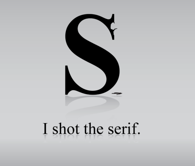
Clever.
As read in Wikipedia: ...in typography, a serif /ˈsɛrɪf/ is a small line attached to the end of a stroke in a letter or symbol,[1] such as when handwriting is separated into distinct units for a typewriter or typesetter. A typeface with serifs is called a serif typeface (or serifed typeface). A typeface without serifs is called sans serif or sans-serif, from the French sans, meaning “without”. Some typography sources refer to sans-serif typefaces as “Grotesque” (in German “grotesk”) or “Gothic”,[2] and serif typefaces as “Roman” (you know, my ancestors created along with the Greeks sooooo many things back then).

Grammar police…
But why should we talk about fonts and design so closely?
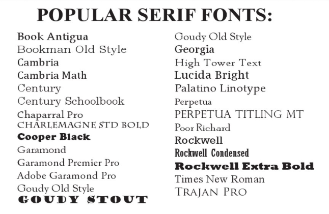
- Serif: Serif fonts have tops and tails at the ends of the letter strokes. These fonts are often used for print documents and are considered more classic style fonts. Most books are printed in a serif font because it lessens eye strain.

Serif cheatsheet
- Sans serif: Sans serif fonts have a cleaner feel because they don’t feature any extra marks at the ends of the letters. These fonts tend to have a more casual feel, and they have become the standard for online copy because they’re easier to read on a screen.

Popular Sans Serif
So to recap: why choose one or the other?
- classic
- more readable
- stable and reliable
- more modern
- more casual and fresh
- more “creative” and alternative

Fonts from http://www.awwwards.com
But for now, I’ll give you MY summary of what my choice would be for an high-impact branding based on the use of fonts:
- Look for visual compatibility but don’t underestimate the power of contrast
- Use colours: they can help guide the reader
- Don’t be afraid of innovation but make sure your product is suitable for the style
- Typefaces have a personality so don’t misidentify the personality of a typeface for a particular purpose
- Mix weights and types but always assign a clear role to them, esp. in blog writing
- Get the help of a pro: they’ll know what to do!
Choosing the right font
Read more:
- Finding the right font
- Typography
- More on typography
- Combining typefaces
- The beauty of typography
- Find fonts and buy them: DaFont

