
Today, for the new appointment of #rainybrandingtuesday, I want to put the attention on presentations. I’ve been interpreting for over 7 years now and as I take part in events on a regular basis both as speaker and as participant, my exposure to power points and pitches has been and still is high! I will not touch on the importance of talking in public (that is a crucial skill for anyone who needs to find new business and attract clients. On the phone, in person, via e-mail… after all it’s communication but I will take care of it in another post, maybe!) so I’ll rather focus on the relevance of good, accurate, spot-on written media that is then orally delivered. As you may remember from my post on ads that sell more words are really king when it comes to reaching out to prospects and turn them into loyal clients. In my experience, most speakers are experts in the topics they cover but they do not necessarily master the art of being concise or clear.
What’s the anatomy of a perfect presentation?
- communicate a clear message
- explain something others do not know
- highlight the best features of an idea or product
- be a guide with pointers to then be expanded
- convince of something
- engage the audience
- possibly entertain
- be short and to the point, both graphically and in terms of content.
Regrettably, what I’ve found over the years is quite the opposite. Slides:
- tend to be crowded with text
- are not clear in content nor graphically
- are too many
- do not make the right use of visuals
- have too small a font / are not readable
- are boring or uneventful
- are used as a written document
So why should not your sales pitch (a presentation, after all) be smashing too and engage?

Tips for smashing prezis
I love the way this presentation talks about the perfect presentation. And don’t forget… a little effort can really make the difference. Keep up the good work and the amazing content and knowledge but never underestimate the wow factor to create a long-lasting impression in your audience’s minds. That’s branding too, right?
What have *I* been doing? My recent presentation used these elements.
- cool images
- personalisation
- great visuals
- simple background
- consistency
And always, always, always bear this in mind:
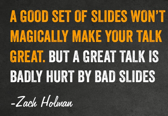
Good and great

Thanks Val! This is very topical for me as I’m currently working on my slides for a presentation in December! Lots of useful tips here!