
A lot is currently being said on colour and on how it affects the psyche and consumers’ behaviour, triggering emotions and reactions that make you buy or not and all that jazz. I have come across this controversial article that backs up exactly what I think about this. In short: “the truth […] is that color is too dependent on personal experiences to be universally translated to specific feelings. Yet, there are broader messaging patterns to be found in color perceptions. For instance, colors play a fairly substantial role in purchases and branding”.
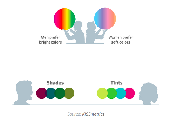
Colour preference in men and women

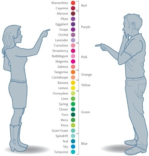
That’s Maroon, darling.
As for design, which is somewhat ultimately related to being a matter of taste (ie. I like this or that, just because), colours do have an impact in the psyche simply because we are used to seeing them used in specific ways and according to specific chromatic patterns. I.e.: White is pure, red is energy and so on. And I’ll tell you a secret: There’s nothing wrong with it IMHO.
Brands use red when they want to be seen as powerful, passionate companies

It’s all about red after all
My takeaways when it comes to choose a palette?
- You – start from what you know & like because ultimately you’re your number ONE customer and critical consumer
- Be open – ask others / bear in mind gender and demographics and see where it leads you. If everyone you ask gives you the same perception of a specific shade, reconsider
- Elementary, Sherlock – research your competitors’ choice. Did they use the same colours? Is anyone standing out? Why? Which colour/s?
- Cultural-bound – analyse / assess your cultural references and your target countries’. Maybe red means something / is associated to a specific concept in India and not in Europe and so on.
- Easy, boy – don’t put too much strain on the eye, yet achieve your purpose. Attracting attention is one thing, affecting your audience’s retinas is a no-no.
- Think consumers – put aside personal preferences and explore what you want your customers to feel. Maybe you’ll see that a specific group of customers / target does like one specific colour you didn’t even consider before.
- Digital vs IRL world – consider how colour transitions from physical to digital worlds & vice versa. Every shade looks paler or darker in print and brighter or sometimes completely different on screen.
- Back to the Fifties – think black and white. Does it work? Those are colours too.
- Defy the diktat – who said men cannot wear pink? Look at what T Mobile did with their pink logo.
- Only diamonds are forever – they say “if it ain’t broken, don’t fix it” but still, why can’t you change a colour or rebrand after a while?

I bet you never considered Chanel to have a masculine flair. Yet, it’s using black.
Another interesting poing to bear in mind is that – regardless the message they are normally attached to – some colours are more suitable for specific purposes compared to others. Mentioning Help Scout again, sometimes a contrasting colour is just what the eye needs to be attracted and take action.
Also, nobody said you cannot try different options – and see whether your brand comes across as more powerful or weaker based on a variation on the chromatic matching.
Up to you:
- What colours do you like and why?
- What colours do you think have an impact – of any kind – on you?
- Do you think colour influences your purchasing habits as a consumer?
