
This #RainyBrandingTuesday is about iconography.
iconography, the science of identification, description, classification, and interpretation of symbols, themes, and subject matter in the visual arts. The term can also refer to the artist’s use of this imagery in a particular work.
This is the definition from Encyclopedia Britannica that in the final part of the paragraph mentions religion and symbolism. Symbols have been around for ages and – like it or not – we are surrounded by them. As in road signs

Hence the importance of symbols.
or in the icons of our computer software or mobile,
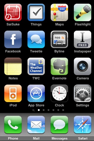
Apps are all identified by an icon
we all know that there’s a common ‘agreement’ behind the concept of a symbol. Each and every one of the has – or should have – a universally recognized meaning. One of the best examples is the Ancient Egypt, perhaps?
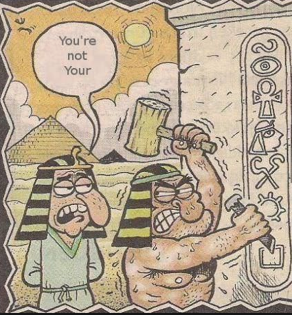
An ancient, typical pet peeve

Grammar police started a while ago…
Iconography is therefore a set of concepts we all share. As I read on FI’s blog (one the most relevant design company in the world):
*UX = user experience, ie. all stuff we unconsciously use on our devices day in, day out.
FI’s study best exemplifies how intuitive today’s design should be for users to immediately get the message.
An icon should be:
- universal
- minimal
- clear
- unique (as in ‘not being mistaken’ for something else)
- evocative
Added-value.com mentions branding and iconography as essential for modern customers.
We believe that people buy a brand when they anticipate it will make them feel better. More specifically people buy a brand when its ‘iconography’ projects an experience that will make them feel better. Brands which renew their iconography whilst protecting its integrity build strong brand connection and equity. These brands become iconic.
As I often mention in my branding talks (by the way, the next ones are in Budapest and then in Porto) to be iconic your brand and name should project a perceived valued that customer identify with. Therefore, choosing the right set of icons goes hand in hand with branding as what we are trying to convey is a MESSAGE. As translators, we are – should be! – the best candidates to use words and concepts as we wish, so it’s worth investing your time in defining what is the (conceptual) iconography of your brand and business.
If I were to create some for Rainy London, you know what they would be. I already went for the London Eye and it does not get more iconic that that!
I’m not saying you should get all design-y and funky with icons scattered on your website 🙂
Think about the iconography of a country, like the UK. Or Italy! I can picture art, sunshine, the Ancient Rome…pizza! These all are elements of our iconography and are conceptually relevant to our idea of Bel Paese.
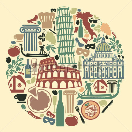
An iconic summing-up

Italy and luxury items in icons
FutureBrand posted:
The iconography of a nation is representative of culture, patriotism, history and pride. The symbolism of a flag or coat of arms is almost sacrosanct and needs to be treated with respect and care, and it needs to be accurate to previous and historic convention.
This article on iconography and branding explains very well, a maple leaf is not any maple leaf for Canada. It’s all about the concept and the icons.
But how do we use icons and iconography in our business?
Underconsideration.com says:
iconography shares a lot of the reductive qualities necessary to tell the biggest story with the smallest amount of visual elements.
That’s what I’ve done with my website (even though it’s been redesigned as we blog so it will change soon):

Upload, ask, contact me. Simples!
Just like on your phone or on marketing material, icons should ultimately help customers or users identify what words would express in much more space. Other sites have done this, in all sectors. Here’s IKEA:
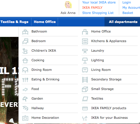
Mixing words and icons
And here’s Pocket:

Pictures to represent pictures
Marta Stelmaszak‘s new website – done by our beloved designer Fabio Benedetti🙂
Clear and concise.
Or the classic set of social media icons:

Can you tell which is which? ‘course you can!
And why not mention Instant Messaging apps like Whatsapp? Emojis are all the rage:

My fave is the flamenco lady.
So to recap, this is how we can use icons for:
- send a clear message
- make UX easier on your site or brochure or CV
- give more harmony and balance to the overall design
- get unstuck from the ‘too-much-text’ rut
- inspire readers to click on the icons/services behind them (call to action)
- isolate keywords and concepts
- create a better understand of who you are, what you offer, why choose you
- show how good you are at interpreting a country’s or an industry’s identity (why not?)
Any other ideas? Share under the hashtag #RainyBrandingTuesday
Some links for you:
- Fab’s portfolio, icons http://www.fabiobenedetti.co.uk/digital-design/#/various-icons/
- Examples http://examples.yourdictionary.com/examples/examples-of-iconography.html
- Pinterest http://www.pinterest.com/ryanshelton/iconography/
- My Good Buzz http://mygoodbuzz.blogspot.co.uk/2010/10/evolution-of-brand-iconography.html
- BBC: video http://www.bbc.co.uk/learningzone/clips/andy-warhol-iconography-and-branding/9990.html
- FI http://www.f-i.com/fi/icons/
- Fun icons and emoji: http://www.i2symbol.com/symbols
See you next week!
