
Many of you probably know that I’m spending this March in California, and what better place to talk branding than the birthplace of my all-time fave, Apple?

Hi, Infinite Loop.
Today’s topic is rebranding.

Rebranding: a simple definition
Yes, because sometimes even great ideas need a little twist to be still relevant and modern. Apple did this in the past, switching from the an intricate tree and apple – representing Isaac Newton sitting under an apple tree reading a book* – to a multicoloured apple that does remind the current logo.
*Fun Fact: The first logo is Indian ink drawing,

The apple that doesn’t fall far from the tree…
The inner simplicity and user-friendly approach that Apple has always predicated converted the colorful options into a black hue then into a minimal, – and to me – almost primordial dirty white. After all, who hadn’t associated white with Mac in the past 10 years?
And also: how would have the brand been different had it used the 1976 option?
Branding sometimes goes all the way far from the existing – and it wins. One example I’m in love with is USA Today: the world became a simple circle and the clever idea here is to use colours to differentiate topics. So intuitive, so obvious, yet genius.
See for yourself how the rebranding permeates all spheres of the brand
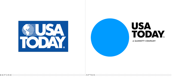
Before the lift.

USA TODAY likes colours
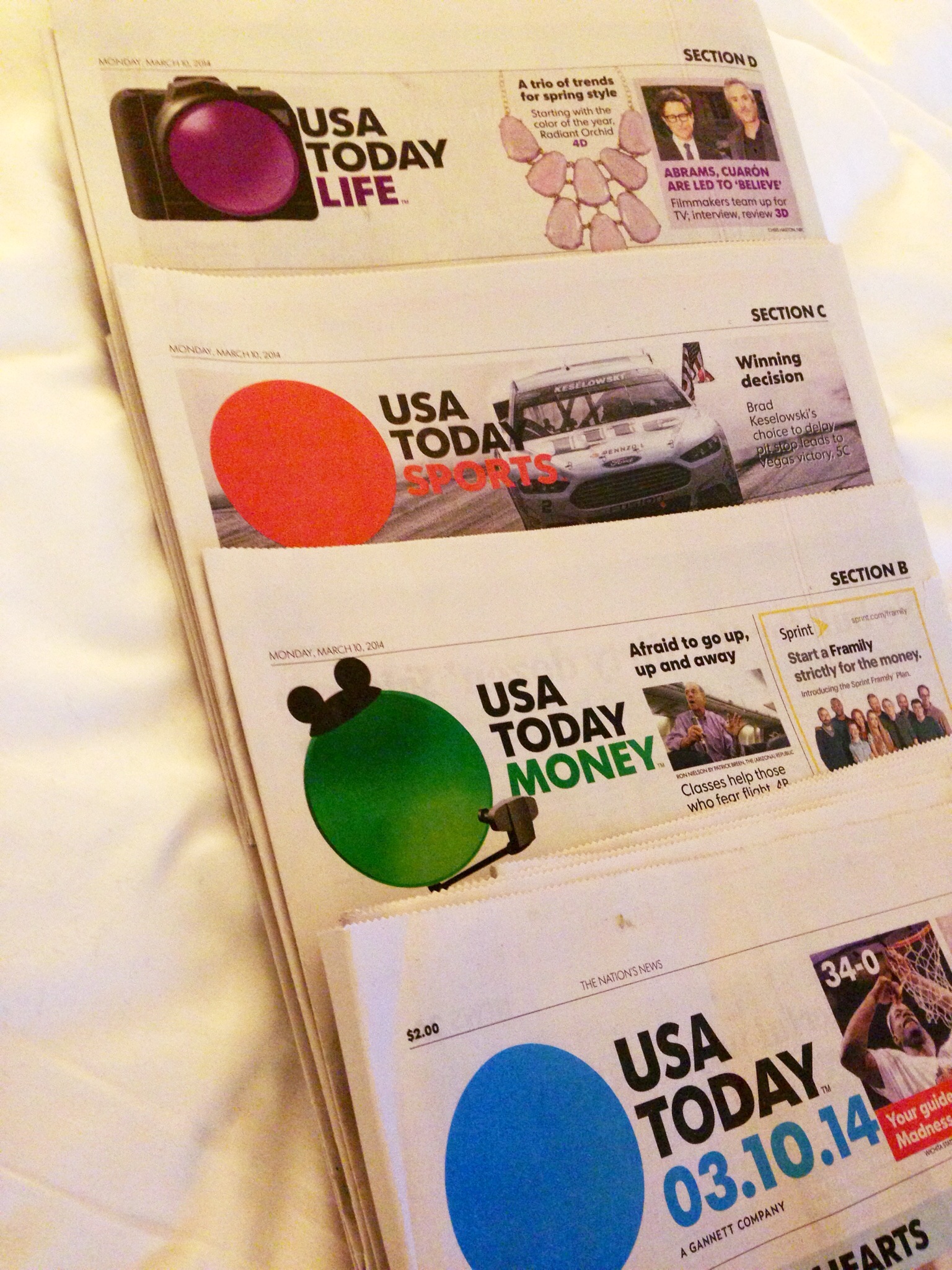
I found it for myself today in the hotel. Brand bliss.
A great example of a sector that really needs style to sell is tourism. We all know that a place like Bahamas is amazing and why would it even need to advertise itself… if everybody knows it’s incredible, right? Well, the existing site of Bahamas wasn’t exactly selling the idea of a paradise: cluttered, non-usable and certainly not very reliable-looking.
This rebranding is nothing short of amazing, just like the diversity of the islands themselves.
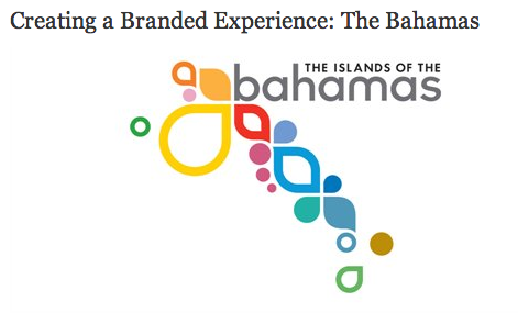
Bahamas is amazing. And I’ve never even been there!
Duffy and Partners took up the challenge, bearing this in mind:
“We quickly determined that the many choices and marketing messages from sun and sand vacation destinations created clutter and a sea of sameness. No one stood out. Nothing seemed unique. The Bahamas was significantly outspent by many of its competitors and they weren’t getting their full return from the many dollars spent by the numerous constituents involved in supporting the country’s tourism efforts”.
So, they decided to
“Create branded desire for the Bahamas. Differentiate the nation as the preferred sun and sand vacation destination”.
Some examples of successful rebranding can be found int the translation industry as well and these two are very close to my heart as we worked on them together with Fabio, my designer: Astra Translations and WantWords.

Before…
and… After!

Before…

and… after!
All this must be supported by impeccable customer care and well, outstanding products, but that’s mostly a given in all industries.
Often rebranding or reformulation… can indeed go wrong. And this is because renewing for renewing’s sake is just, well wrong. As they say, if it ain’t broken, don’t fix it.
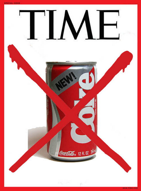
That’s what some very famous brands tried (and failed) in the past and the example I chose is Coca-Cola. As mentioned in this article on the topic, the the mistake was making a “New Coke”:
When Coca-Cola changed the formula for its famous Coke brand in 1985, the public reacted as if the company had ruined a symbol of America. It took less than three months for Coca-Cola to pull the new formula from shelves and return to the original formula which they rebranded as “Coke Classic.” What happened? Some marketing experts believe that Coca-Cola failed to ask the simplest and most important question: “Do we need to reengineer our formula?”
If the Time goes no, well… it can’t be good.
How does rebranding create a plus for your business?
- it creates interest and possibly makes you the talk of the minute
- it shows you care: investing in your image makes you ahead of the time and shows you are not scared of (good) change
- it can create more added value: you can decide to retarget the brand too. Apple was already an elite brand but pushed it over the limit with the new style + conceptual look
- it helps sending a different message: maybe you wish to attract a different type of client or branch out into a new business. This fosters the change
- it makes you more credible: especially when done professionally and with clever scope, a new logo or a rebranding shows you can be trusted.
Want to read more? Read these:
- http://www.businessinsider.com/10-most-successful-rebranding-campaigns-2011-2?op=1
- http://www.imediaconnection.com/content/35148.asp#multiview
- http://www.forbes.com/sites/panosmourdoukoutas/2013/10/05/apples-most-important-branding-lesson-for-marketers/
(and follow the hashtag #RainyBrandingTuesday of course!)
