Be a pro, hire a pro

Today’s #RainyBrandingTuesday wants to follow up on the way you work with professionals.

Since the launch of Rainy London Branding, I’ve had the pleasure to work back to back with many professionals who needed to find their voice and with designers and programmers who are taking care of the technical side of it all. In all this, we always need to consider that we are good with words, especially as interpreters and translators. Therefore, just as we would for a translation or a conference with our clients – but even with a plumber if we need him to fix our bathroom leakage – we need to remember the importance of a good dialogue. Otherwise, our interactions make just for another anecdote from Clients from hell:
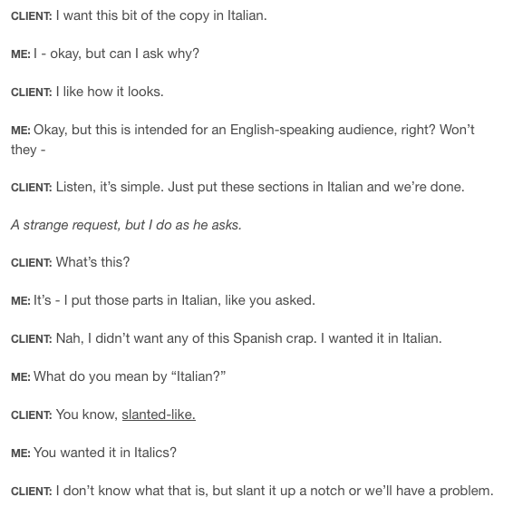
Italian...

Italian…

Eventually though… it only dawns on us that we are all the same, as clients. So if we want to get treated in the right way, we need to give what we want to get.

Design especially is a matter of taste and personal moods – and in many, many cases, the design client does NOT know what s/he wants until… S/HE SEES IT.

And sometimes clients do not know and are not supposed to know the technicalities nor how we work so… make sure you talk in a way they can relate to.

But as branding is such a crucial part for businesses of all sizes, sooner or later we would need to liaise with the designer aspect.

Designers are nice – I live with one, I can vouch! – My tips to work with a designer (or any other professional for that matter!) are basically… all around a brief.

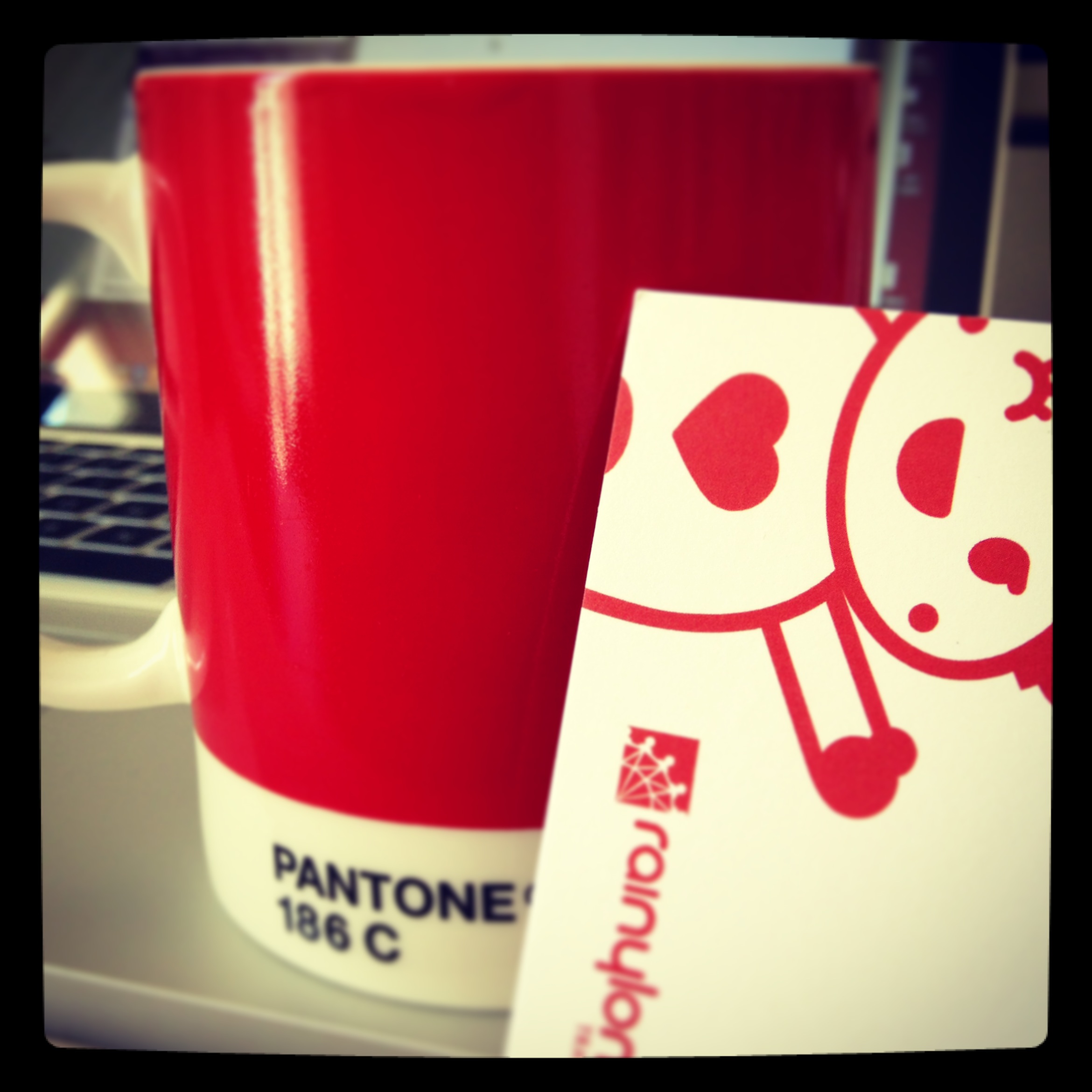
Fabio – my designer – has worked on these logos and some sites:

Astra Translations, Dania Training, WantWords, Masterminf Translations, Verbatim Translations, Momo Translations, English Rose Berlin and Trema Translations were designed by fabiobenedetti.co.uk. Isabel Espuelas is great too but is not our design.

Astra Translations, Dania Training, WantWords, Masterminf Translations, Verbatim Translations, Momo Translations, English Rose Berlin and Trema Translations were designed by fabiobenedetti.co.uk. Isabel Espuelas is great too but is not our design.

and we always use this brief chart to make sure that the inception of a logo is driven by a good reasoning:


This is a way to make sure your designer is aware of your idea. You can also create a moodboard – with pictures or images or scans of your writing… just inspiration. Pinterest is a very good way, too!

Then remember:

  • find a pro: as I always say, you don’t want clients to go for non-trained or unprofessional translators, the same is true for any other fields. Walk the walk
  • browse their portfolio (or ask for one): maybe you find something that inspires you
  • agree fees: on delivery, in advance… normally, it’s a part in advance and then if your project is big, there will be installments
  • agree payment terms ASAP, esp. if the supplier is abroad, and get a signed PO / terms or a binding e-mail clearly stating dates and conditions
  • be ready to invest: not millions! But make sure your design shows professionalism. Most of the times my services are chosen because my website is professional and looks “the part”
  • talk to them in the clearest way: make examples, sketch… inspirational boards are great. Give the designer as many examples as possible
  • don’t rush it. Logos can take weeks. Be wary of those who offer you a logo in 24 hrs if you really want a thorough job
  • brainstorm and ask when in doubt. Better asking than feeling sorry later
  • if you don’t like the design, just explain why. As I mentioned before sometimes you don’t visualize anything until you see it

You should then think of the different media. Bear in mind that you may need Twitter + Facebook covers but also business cards and brochure design, banners etc.

This is what I’ve done for Rainy London Translations:

Facebook cover

Rainy London Translations: Facebook cover

Screen Shot 2014-05-27 at 15.53.53

Rainy London Translations: Twitter cover

What is the point here? While the design is the same, the format and the sizing may change.

In that case, make sure you ask:

  • whether these changes are included in the quote/fee
  • if the artworks are provided for these media
  • print is different from web so formats for the printers are different. Just ask!
  • get the right format (be it .indd or .eps etc)
  • Ask for jpeg or PDF version too, they may come in handy
  • don’t give anything for granted and ask to double check.

For further info or doubts, you can always drop me a line!

And now some fun: Design hell and Design changes 

See you next week!


Names, names, names: it’s all about vision

Welcome to a new #RainyBrandingTuesday!

Choosing a name for a brand or a business is always the trickiest of parts. If you’ve been to one of my #rainybranding talks (the next is on Saturday in Porto), you have an idea of the reasons behind mine (and you’re aware of the bad and the ugly before getting eventually to a good one). Also, I’ve already talked about this in a past post but it’s such a heated topic that I thought it would be worth revisiting.

Rainy London Business Cards (and one fave mug)

Rainy London Business Cards (and my Pantone mug)

First of all, should you use a brand (as in creating / inventing a name) or should you trade under your own name?

I am a supporter of standing out and diversify (read more on this topic in a very nice book I have contributed to) and I chose to not trade under my name and surname simply because my audience may find it hard to pronounce and I wanted to make sure my business was able – in the future too – to encompass a wider range of possibilities.

Yet, there’s no right or wrong!

As read in FreelanceFolder:

Using your personal name as your business name is the easiest and fastest way to come up with a brand.

If you’re just starting out or are not sure if you’re into freelancing for the long haul, this may be the best option for you. However, if you have a common name, it’s a good idea to register your personal name anyway, to avoid duplication.

On the other hand, using your personal name as your business name does have its disadvantages too.

1. your business may be perceived as less professional, less serious and even less credible than if you had a “real” business name.

2. it may be much harder to sell your business later. Investors in general would be unwilling to purchase an existing business that’s tied too much to a specific person–unless you become rich and famous, of course.It’s also impossible to communicate your Unique Selling Proposition by using your personal name, instead of a punchy but meaningful business name.

Still, coming up with a name is the hardest part, as mentioned before.

It needs to be memorable, evocative, and meaningful (and possibly: easy to remember!)

Regarding the why of a name or a brand, Marie Forleo is open to possibilities. As she cunningly mentions in her video, it’s all down to

Your Industry

Your Vision

Your long-term plan

The thre points to choose a name

The thre points to choose a name

As she explains very clearly, there is not a successful way and path-to-failure one. You can be successful by sticking to your name if you know it’s going to be YOU and you as an asset for a while; still there are plenty of examples around to prove that empires can be sold and still be doing fantastically well even if the founder is no longer there,  e.g. Jo Malone or Donna Karan or Harrods. 

Freesia and Pear: one of my alltime fave scents.

Freesia and Pear: one of my alltime fave scents.

Product, Service and Business

Product, Service and Business

It has that charming look though...

It has that charming look though…

This extremely interesting and straightforward article is really helpful – and is so good I felt the urge to share it almost in its entirety.

What parts should one be considering when choosing a name?

Appearance – Simply how the name looks. It will always be seen in context, but it will be seen, so looks are crucial too.

Distinctive – How differentiated is a given name from its competition. Being distinctive is only one element that goes into making a name memorable, but it is a required element, since if a name is not distinct from a sea of similar names it will not be memorable. It’s important, when judging distinctiveness, to always consider the name in the context of the product it will serve, and among the competition it will spar with for the consumer’s attention.

Depth – Layer upon layer of meaning and association. Names with great depth never reveal all they have to offer all at once, but keep surprising you with new ideas.

Energy – How vital and full of life is the name? Does it have buzz? Can it carry an ad campaign on its shoulders? Is it a force to be reckoned with? These are all aspects of a name’s energy level.

Humanity – A measure of a name’s warmth, its “humanness,” as opposed to names that are cold, clinical, unemotional. Another – though not foolproof – way to think about this category is to imagine each of the names as a nickname for one of your children.

Positioning – How relevant the name is to the positioning of the product or company being named, the service offered, or to the industry served. Further, how many relevant messages does the name map to?

Sound – Again, while always existing in a context of some sort or another, the name WILL be heard, in radio or television commercials, being presented at a trade show, or simply being discussed in a cocktail party conversation. Sound is twofold – not only how a name sounds, but how easily it is spoken by those who matter most: the potential customer. Word of mouth is a big part of the marketing of a company, product or service with a great name, but if people aren’t comfortable saying the name, the word won’t get out.

“33” – The force of brand magic, and the word-of-mouth buzz that a name is likely to generate. Refers to the mysterious “33” printed on the back of Rolling Rock beer bottles for decades that everybody talks about because nobody is really sure what it means. “33” is that certain something that makes people lean forward and want to learn more about a brand, and to want to share the brand with others. The “33” angle is different for each name.

Trademark – As in the ugly, meat hook reality of trademark availability. Scoring is easy here, as there are only three options, and nothing is subjective: 10 = likely available for trademark; 5 = may be available for trademark; and 0 = not likely available for trademark. All of the names on this list have been prescreened by a trademarked attorney and have been deemed “likely” for trademark registration.

When my dad suggested 'Gladiator' Translations I'm sure he didn't refer to sandals (shame)

When my dad suggested ‘Gladiator’ Translations I’m sure he wasn’t thinking of sandals (shame)

Now over to you:

  • Are you struggling to find the name your website or company?

  • What’s holding you back?

  • Are you in need in inspiration? Or simply cannot decide?

  • image

You can always hire me <wink wink>

Further readings:

  1. http://www.igorinternational.com/process/filters-naming-powerful-names.php
  2. http://www.thenameinspector.com/10-name-types/
  3. http://freelancefolder.com/branding-your-freelancing-business-personal-name-vs-business-name/


Opportunities: don’t let them slip away (hint: use branding)

It’s #RainyBrandingTuesday!

Branding is such a big topic that every week I’m spoilt for choice. This time, though, I’d like to talk about opportunities and how branding yourself has to do with them.
In the latest issue of Inc Magazine (April 14) I was intrigued by an article on The 8 best industries for starting a business. And surprise surprise… one is translation.
The bottom line, as the piece says is that by 2018, the industry will grow by $39 billion (Forbes in Spanish also mentioned interpreters and translators as one of the businesses of the future – yay!)

With 6,700 languages on the planet and an increasing demand for tourism and medical services in other languages… well it’s all about opportunities.

6,700 languages. And I can only speak 4!

6,700 languages. And I can only speak 4!

So, how does this link to branding?

As we are master of words (both written and spoken) we should focus on the opportunities they give us to express ourselves better. And this can be done by creating a tangible experience for your potential customers.
As Kelly O’Keefe, professor of brand management and innovation at Virginia Commonwealth University’s Brandcenter advertising school, says:

[…] in the ’90s advertising was a tool to build brands, working with connecting them to short messages or images. But it stopped working. If Consumers feel like they’ve been lied to, they discount the message and look for deeper signals.

A brand voice is important but nowadays it’s also about the brand behavior and the touch – the engagement to the client base. When brands engage the public – think of the pop-up shop that Chanel envisaged in 2012 for the boutique in the Covent Garden Piazza that ended up being so successful that was turned into a permanent shop (to my delight!) – the client can walk away with an experience, that can then be shared in person by telling others or via social media, email, phone. This makes them our new and most powerful advertising tool!

Flowers and pretty things: always do the trick

Flowers and pretty things: always do the trick

A special vending machine. With a person inside!

A special vending machine. With a person inside!

How can you leverage on this opportunity as a freelancer?

Of course we need to think on a much smaller scale and focusing on the type of target clients we have but they resources are many:

  • tell a story ––> in every email you send to prospect clients, try to engage them in a success story related to their need and what you could help them achieve. Examples are great and people can relate on a personal level.
  • offer something that not every one is getting —>  it does not have to be a discount but a special feature your client can use like access to a link or an article you’ve written, something you’ve published – maybe a booklet you’ve translated and that can be relevant to their business – or a book you’re writing so they will feel unique and cared for. This can be done via QR codes on your email for instance that lead your reader to exclusive content or, why not, even discounts if that rocks your boat (or theirs).
  • the ‘usual’ cards + extras (I have cards and cups for example) —> esp. with existing clients that already appreciate your work. Make yourself remembered and visible in their eyes. Little details and some kindness do work well when they are paired with the good quality of your work.
  • use social media to make your audience part of your business —> It’s true that as I said in many other occasions, not every customer will buy from you based on your use or profile on social media. Yet, nowadays being “special” is unexpected and can be very well perceived. I was recently at an event on maritime shipping and all it was discussed was the lack of visibility of this industry. I’m sure that cargo ships are not hired solely relying on a company’s posts on a FB page (!) but these are all elements that show you EXIST and care for what goes on in your industry. So create an hashtag or an initiative (like the lovely LYT, http://loveyourtranslator.com) to raise awareness on the fact that good translators are out there and can boost clients’ business.
  • make videos —> this classifies under the social media category perhaps but it’s something that I’ve been thinking about for some time now and I believe very much in the power of videos. Maybe you won’t go viral strictly speaking at least but videos can be an engaging way to communicate with your clients. People buy from people and especially for interpreters or speakers or even designers, video clips and screencasts showing how you do your job are a great way to market yourself.

As you may have noticed, this week I’m all about opportunities because branding after all is a mirror of what you are and of the opportunities you are faced with every day.

Don’t let them slip away!


Keep things shipshape: in life and in branding

Welcome to a new #RainyBrandingTuesday appointment. Today it’s all about shapes.

I recently gave one of my talks on branding  – where I explain about the case study for Rainy London Translations – and I mentioned, as usual, color and the importance of the right palette.

There’s a very specific psychology behind the selection of colours – I wrote a blog post on this a few weeks ago – but way too often we forget that SHAPE is also fundamental.

Not THESE shapes.

Not THESE shapes.

When a client asks me about their logo design, the first thing that my designer wants to know from him or her is the style s/he likes and dislikes. This includes the perception of attributes that your style is made of and that kind of brief (I like feminine or masculine, aggressive or muted, round or small, circular or schematic…) is achieved by filling this:


This chart is essential to get the brief right

This chart is essential to get the brief right – by FabioBenedetti.co.uk

This helps your designer understand what you want and saves you a lot of misunderstanding and delays. As Amy Wong writes on this Blog Studio’s post: 

The principle shapes used in design are classified into two categories: 1) circles, ovals and ellipses, and 2) squares and triangles. Other important aesthetic factors include vertical versus horizontal lines and angular versus rounded shapes.

  1. Circles, ovals and ellipses are typically associated with a positive emotional message. These round shapes signify unity, and by extension, community, friendship, love, and relationships. Rings in specific imply marriage and partnership, suggesting stability and endurance. Curves of any sort tend to be viewed as feminine in nature.

  2. Squares and triangles, with their straight edges, are associated with strength, professionalism, and efficiency because of their precise nature. These rigid shapes imply practical stability and balance. Depending on what colours they are combined with, they may appear cold and uninviting. To counter that, off-balance positions or vibrant colours can yield a more interesting effect. Moreover, triangles have been said to be associated with power, science, religion, and law. These tend to be seen as masculine attributes, and are featured predominantly in companies with masculine-biased products (think cars and machinery).

  3. Vertical lines are subconsciously associated with masculinity, strength and aggression, while horizontal lines point to community, tranquility, and calm.

Ultimately, what matters is that your logo is your brand. Your brand is your business. So the aim is: make sure your first interaction with your customers is positive as you can’t give a second  first impression, really.

As mentioned in this article by Full Circle Design the 2012 London Olympics logo is a fiasco in terms of shape.

In an effort to capture multiple emotions and images at the same time with the shape, Wolff Olins created a muddled design, which attempts to combine the year of the event and the energy and eclectic nature of London, creates an indecipherable mess. If it weren’t attached to such a major, newsworthy event, nobody would have been able to tell you what was being said here.

London 2012 logo. Or a huge, pink Lisa Simpson.

London 2012 logo. Or a huge, pink Lisa Simpson.

(Personally: I keep seeing a kneeling-down Lisa Simpson with Olympic rings in her hair on the right-hand side. Just sayin’).

Shapes are important because just as colours, they ‘shape’ (no pun intended) the thought and what sticks to your retina.

As in the principle of Gestalt:

“People will perceive and interpret ambiguous or complex images as the simplest form(s) possible.”

Smashing Magazine on the perception of design mentions that:

‘We prefer things that are simple, clear and ordered. Instinctually these things are safer. They take less time for us to process and present less dangerous surprises.’

Simples.

Simples.

Therefore a logo like the one that FedEx has been using since 1994 is simply brilliant and design-wise, just perfect.

Can you spot the arrow?

Can you spot the arrow?


The triangle that serves as the arrow’s head furthers the emotional reaction that the color combination creates. The second you see this logo on the side of a truck or on an envelope, you remember it and understand what FedEx does even without additional text.

The same is achieved over time by timeless branding like Chanel or Coca Cola.

All in the shape.

All in the shape.

But also Shell, NBC, and Nike

Branding is iconic. And sticks to your retina.

Branding is iconic. And sticks to your retina.

are great examples of how appropriate the style is for their type of business.

As this post on CreativeBloq underlines,

Particular logo shapes send out particular messages:

Circles, ovals and ellipses tend to project a positive emotional message. Using a circle in a logo can suggest community, friendship, love, relationships and unity. Rings have an implication of marriage and partnership, suggesting stability and endurance.  Curves on any sort tend to be viewed as feminine in nature.
Straight edged logo shapes such as squares and triangles suggest stability in more practical terms and can also be used to imply balance. Straight lines and precise logo shapes also impart strength, professionalism and efficiency. However, and particularly if they are combined with colours like blue and grey, they may also appear cold and uninviting. Subverting them with off-kilter positioning or more dynamic colours can counter this problem and conjure up something more interesting.
It has also been suggested that triangles have a good association with power, science, religion and law. These tend to be viewed as masculine attributes, so it’s no coincidence that triangles feature more prominently in the logos of companies whose products have a masculine bias.
Our subconscious minds associate vertical lines with masculinity, strength and aggression, while horizontal lines suggest community, tranquillity and calm.
The implications of shape also extend to the typeface chosen. Jagged, angular typefaces may appear as aggressive or dynamic; on the other hand, soft, rounded letters give a youthful appeal. Curved typefaces and cursive scripts tend to appeal more to women, while strong, bold lettering has a more masculine edge.

In this sense, try to make sure the shape of your logo:

  • respects the purpose you initially wanted (be simple, feminine, strong,…)
  • reflects the business you’re in (appropriate. e.g. Toy R Us is playful and childish enough)
  • works well with the palette you’ve chosen
  • is versatile yet an evergreen
  • works well in negative (black & white) and does not evoke further shapes
  • I only see one thing. Actually, two.

    I only see one thing. Actually, two.

  • has a positive message and cannot be misunderstood
Not hungry anymore, really.

Not hungry anymore, really.

So, what shapes do you think work best for your purpose? Is your brand shipshape?

Further readings: